Not Found
Not Found
Not Found
Not Found
Not Found
Request path contains unescaped characters
Not Found
Not Found
Not Found
Not Found
Not Found
Not Found
Not Found
Not Found
Not Found
Not Found
Not Found
Not Found
Not Found
Not Found

All comments

  • Duchessa 70

    @duchessa01

    Submitted

    Hello! It was a funny challenge. I had problems using the <picture> tag, didn't use it, but still managed to get a result I love. All kinds of problems arised when I tried to center <main> with flexbox. Getting it pixel perfect as the guide image wasn't my point. The result? I left it as it was ahah :) I used one media query just to resize the picture height and I'm happy with it. What do you think? Any suggestions? Any ideas of things I could have done easier than I did?

    AntoineC 1,180

    @AntoineC-dev

    Posted

    Hello Duchessa. Good job completing this challenge 🎉🎉🎉.

    I see that you have good basics in front-end and the result is great.

    I will try answer your questions to the best of my abilities and give you some small advises:

    • First of all about the "centering". I think that you were really close to the solution because I can see that you already know about the margin: auto trick with flexbox which worked on the inline axis (horizontal) already. However to make it work on the block axis you need to give a height (or in this case a min-height) to the body element.

    the code would look something like this:

    body {
        /* KEEP Previous styles ... */
        min-height: 100vh;
        display: flex;
        flex-direction: column;
        justify-content: center
    }
    
    main {
        /* REMOVE previous styles */
        margin: auto; /* Put the main in the center & push footer at the bottom */
        padding: 1rem;
        width: min(100%, 40rem);
    }
    

    You can remove every over margin: auto in your css and all max-width.

    Note: the property width: min(100%, 40rem); is a shorthand for width: 100%; max-width: 40rem;

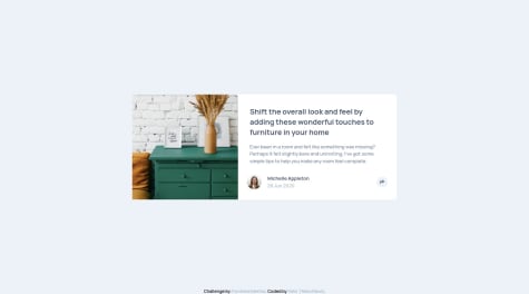
    • If you look closely, the border-radius is not "applied" to the image in the .product-card. It happens because the image overflows its container and does not have a border-radius itself. Rather than giving it a border radius you can add the property overflow: hidden to the .product-card which will hide the sharp edges of the image that are "outside" of the section.
    • The image looks distorted when the screen's width is between 380px and 575px. To fix that add the property object-fit: cover to the .product-img class.
    • I would suggest that you add a little transition on the "Add to cart" button for the hover effect. It could be something like this:
    .add-to-cart {
        /* KEEP previous styles */
        transition: 300ms background-color linear;
    }
    

    You can play with the duration and the timing-function as you like until you find something that you like 👍

    <picture>
        <source media="(max-width: 649px)" srcset="./src/assets/mobile/image-header.jpg" />
         <img
           class="header__image"
           src="./src/assets/desktop/image-header.jpg"
           srcset="./src/assets/desktop/image-header.jpg"
           alt="An orange sliced in half" />
    </picture>
    

    That's it. I hope it helps. Have a nice day/night and happy coding 😊

    Marked as helpful

    1
  • AntoineC 1,180

    @AntoineC-dev

    Posted

    Hello Hamsalekha. Good job on completing this challenge 🎉🎉🎉.

    I have some feedback for you.

    • I see that you used the float property on many of your elements. If I can give you an advice, it would be to try rethink your layout but using flexbox. Float is hard to use and leads to a lot of side effects. Float is a more modern and simple way to create layouts. Check this link to learn everything about it.

    • I also see that you always wrap your elements with unnecessary containers. You should try to keep you markup as light as possible which will be easier with the flexbox property as well.

    • On my phone the content of your cards is overflowing their containers (the bottom of the text goes out of the card). It happens because you applied a fixed height to your cards. As a general rule you should not set a fixed height on any elements. If you really think you need it; a min-height is ok and will give you elements the ability to grow if the content is too long.

    I would say that the best thing you could do now is try the same challenge with a different mindset. If you have difficulties you can look at this solution from @elaineleung.

    I wish you happy coding and keep going ! Peace 😊

    Marked as helpful

    1
  • @clarencejulu

    Submitted

    I decided to add a backend for this project using JSONServer and Heroku, to store the amount of items left, progress bar info etc. I also implemented localstorage to store whether the project has been bookmarked or not. Please review this project and let me know your honest opinions. Thank you in advance!

    Crowdfunding Product Page using JSONServer and ReduxToolkit

    #fetch#react#react-router#redux-toolkit#sass/scss

    1

    AntoineC 1,180

    @AntoineC-dev

    Posted

    Hello Clarence, what's up ? Good job completing this challenge 🎉🎉🎉 All basic styles (colors, typography, etc...) seems to be correct so nice work!

    I have 3 advices for you:

    • You should add the property cursor: pointer to all interactive elements, in this case all the links and buttons. This is a small detail that goes a long way for better user experience.

    Now to fix the issues in your report:

    • You should wrap both sections (home & about) in a main tag. You did it already for the header which is great!

    • Same for the <div id="wrongValue" class="notification"></div>. The parent container should be an aside element. It is the landmark you should use for all the elements outside of header, main or footer.

    Have a nice day/night. Peace 😊

    Marked as helpful

    1
  • AntoineC 1,180

    @AntoineC-dev

    Posted

    Hello Yaika. Congratulations on completing this challenge 🎉🎉🎉.

    I have some small suggestions to help you improve your solution:

    • I did not try this challenge but it seems that there is a box-shadow applied to the card (your main container) in the original design. It is a really easy fix since you used tailwind. They have some build in box-shadows that you can use. If however you want to create a custom one here is a resource where you will find a lot of different examples. Just create a custom utility like you already did with the @apply directive.

    • There is a small issue with the rounded corners of your image. A simple solution would be to remove the border-radius on the image and add the property overflow: hidden on the main element. The image will then follow the shape of the container.

    There you go, that is nothing really 😊 You did a great job. Happy coding!

    Marked as helpful

    1
  • Angel Lam 50

    @Azn4n6el

    Submitted

    I think the structure was the most difficult thing for me in this project. I am unsure of my accessibility practices, when using section should I always include a label? differences between aria-labelledby and aria-label. Is div really necessary when you have all these landmarks?

    AntoineC 1,180

    @AntoineC-dev

    Posted

    Hello Angel Lam. Great Job completing this challenge 🎉🎉🎉.

    I will try to answer your questions to the best of my abilities.

    • A section wraps a bunch of closely related content. For example on a landing page you could have a hero section , then a features section, etc... In this project using an article is a good choice in my opinion because this is self-contained content but you should replace the sections with some divs. As you know a section should always have a title. Depending on the structure of your page it could be h1 (if you have only one section), h2, h3 etc. If the design does not show a title because the content is self-explanatory for sighted users you should add one anyway for screen-readers and give it a visually-hidden or sr-only class.

    Here is an example:

    .sr-only {
      position: absolute;
      width: 1px;
      height: 1px;
      padding: 0;
      margin: -1px;
      overflow: hidden;
      clip: rect(0, 0, 0, 0);
      white-space: nowrap;
      border: 0;
    }
    
    • aria-label is used on an element that as a meaning that is obvious for sighted users but contains no descriptive text. For exemple an hamburger button to toggle a mobile menu. You know that it is the menu because you can see the icon but imagine that you can't see. Then this is just a button with nothing inside. You could add an aria-label saying "toggle mobile menu" and now it makes more sense. You could also use a span with the sr-only class I showed you which gives the same result.

    • aria-labelledby is used when the descriptive text for an element is placed somewhere else in the code. It is a reference to the id of the element containing the description. For example you could have input and link it to its label.

    • The div element is a tag that you use only to style something. You could use it to apply flex or grid, etc... Anything that is only related to layout and styles. It has no semantic meaning and is useful when nothing else makes sense.

    Hope it helps. Again, good job and happy coding 😊

    Marked as helpful

    1
  • AntoineC 1,180

    @AntoineC-dev

    Posted

    Hi Alba. Great job completing this challenge 🎉🎉🎉.

    It look really great and minus some small accessibility issues stated in your report that you can easily fix; I have only two small advices to give you.

    I would increase the font-size of the .text paragraphs in your cards and increase the opacity a bit because it it really small right now which makes it hard to read. I am not that old 😁 and even I have some difficulties reading them.

    I would also make sure that the card-image content always stay vertically centered by adding the property align-items: center on the container.

    That's all! Again great job and happy coding 😊 Peace.

    0
  • AntoineC 1,180

    @AntoineC-dev

    Posted

    Hello Aatif Sohel. Good job on completed this challenge 🎉🎉

    It looks good at 375px and above 1280px. However as stated by @Yehan20 you should avoid using fixed sizes.

    The goal is to make the component take the maximum space available but give it the ability to shrink to fit in the screen.

    You have two ways to implement a max-width:

    .my-component {
        max-width: 32rem; /* 1rem = 16px */
        width: 100%;
    }
    
    .my-component {
        width: min(100%, 32rem);
    }
    

    Secondly I think you should have a transition on your buttons on hover and add the :focus selector to make sure the styles also change when the user focus the button with keyboard navigation.

    An implementation could be:

    .my-button {
        color: white;
        background-color: black;
        transition: color 300ms linear, background-color 300ms linear;
    }
    
    .my-button:hover,
    .my-button:focus {
        color: black;
        background-color: white;
    }
    

    Hope it helps. Happy coding. Peace 😊

    Marked as helpful

    2
  • AntoineC 1,180

    @AntoineC-dev

    Posted

    Hello Govindupadhyay good job completing this challenge 🎉.

    Unfortunately I can't review your code because your component is not displayed at your URL.

    To fix this issue you should put all the code relative to your site in the root of your github repository.

    The problem is that right now Netlify can't find the entry point to your app (index.html).

    As a general rule, you should always have an index.html file in the root of your project. Then you can structure the rest however you want if you give the correct paths to the files.

    Hope it helps. Have a good day/night. Peace 😊

    0
  • AntoineC 1,180

    @AntoineC-dev

    Posted

    Hello Ferdinalaxewall. Congratulations on completing this challenge 🎉. Almost everything seems to work fine and it looks really close to the design.

    There is a small issue tho which you might not know about if you don't use Firefox.

    I will always get the same advice because of the caching system of the Firefox.

    To fix this behavior you should have an additional option to your fetch call to prevent the caching of the response.

    I see that you use ajax which i am not familiar with but it should be something like this:

    $.ajax({url: "myurl", success: myCallback, cache: false});
    

    Anyway. Good job again and happy coding 😀 Peace.

    0
  • @The-indigo

    Submitted

    Had a hard time figuring out using flex alone for responsiveness of the cards while still maintaining their width on different screen sizes (min-width and flex wrap) and resorted to using media queries which felt a bit hacky.

    AntoineC 1,180

    @AntoineC-dev

    Posted

    Hello Adepoju Adeyemi Joshua. Congratulations on completing this challenge 🎉. It is really well made so good job overall!

    I have some small suggestions for you regarding minor problems:

    • You should probably try to rethink you layout using grid. It is the perfect opportunity to use this awesome CSS property. The design is a lot of very similar cards in a repetitive order which is a perfect match for grid. This awesome article will help you get started.

    • You forgot to update some styles on dark mode like the icons & color of the font in your input-div

    • I would use a <header></header> element instead of a <div class="header"></div> for your header which would add more semantic value to you HTML and fix a lot of warnings in the report of your solution.

    • I would add a link on the Where in the world? text which redirects to the homepage. This is a feature everyone expects on a website nowadays and really quick to implement.

    • I see that you used h4 tags for all your titles. I guess you did it for a styling purpose (in this case the font-size) but this is not a good practice. heading tags should have a logical order in the page. First a single h1 then one/multiple h2 etc... Then you would style them using CSS according to your needs. This is especially important for accessibility.

    • Lastly regarding the images of the cards on the home page; I would add a min-height to make them look closer to the design and also add the property object-fit: cover to prevent any distortion.

    Fell free to ask any question if you have some trouble fixing some of these issues.

    Again good job with your solution and happy coding.

    Peace 😊

    Marked as helpful

    1
  • Katherine 100

    @rendongzha

    Submitted

    Hi everyone, I use localStorage to store and get the search and filter conditions so that they are persisted after I click through to the detail page and then come back. Is there a way to persist the input value while using useRef hook? In the SearchFilter component, I was using useRef to refer to the search bar value, but I found it difficult to initialize the reference value, so I changed to useState hook, which works well. Thanks in advance for any suggestions!

    AntoineC 1,180

    @AntoineC-dev

    Posted

    Hello Katherine. Congratulations on completing this challenge.

    Regarding your question about the filters. I think local-storage is a really good solution if you need to keep the values when the user closes/refreshes the browser but if you just need to keep the "state" when your switch between components/pages you might wanna use a state management solution. I have three of them in mind so take a look and see if it fits you requirements:

    1- The Context API. It is the built in solution in React but can be a bit hard to setup and quite verbose. However it means no additional dependencies which is always great 😉

    2- Jotai Very simple and flexible state management library for React.

    3- Zustand. This is my favorite. Really awesome state management library.

    Each of these solution allow you to "share" some state between components/pages.

    Hope it helps. Happy coding. Peace 😀

    Marked as helpful

    1
  • @MonaElshikh

    Submitted

    Hi Everyone, I am happy to share my work with you, it was a nice challange , there was one challancing thing which is parsing the shorten links from localstorage, it did not work, it gaves a string even after JSON.Parse(), so after long search i found that it must be parsed twice.

    i will appreciate your comments and modifications

    Thanks a lot.

    AntoineC 1,180

    @AntoineC-dev

    Posted

    Hello Mona Elshikh. Congratulations on completing the challenge. I just made the same one and i think it was really fun 😊.

    I have some small suggestions for you:

    • I think that you forgot to hide the hamburger button on desktop. Because right now i can see it and click on it even on larger screens. You might want to add a display: none at your breakpoint of choice.

    • Also the "Shorten it" button has two small problems:

    1- The text is breaking on two lines at ~1200px which can be easily fixed with a white-space: nowrap on the button.

    2- To make sure it always stays at the same height as the input you could add align-self: stretch

    Hope it helps and happy coding 😀

    Marked as helpful

    1
  • @okekevicktur

    Submitted

    I learnt grid. Wasn't easy at first but I finally got used to it. Now, I am a lover

    AntoineC 1,180

    @AntoineC-dev

    Posted

    Hello Victor Okeke. Good job on completing the challenge. This is a good work. It looks really close to the design which is great!

    I have some small suggestions for you:

    • You might want to make sure the the content is always centered on the screen by adding some properties to the body element:
    body{
        font-size: 13px;
        font-family: 'Barlow Semi Condensed', sans-serif;
        background: hsl(210, 46%, 95%);
    
        display: flex;
        min-height: 100vh;
        justify-content: center;
        align-items: center;
    }
    
    • I see that you used min-width for your container on desktop but instead i would use this:
    .container{
          min-width:1200px; -- Remove this
    
          max-width: 92rem;
          width: 100%;
    }
    

    You could also use the CSS function width: min(100%, 92rem) which gives the save result.

    1rem = 16px feel free to experiment with it to keep it close to the design. Because right now it looks really stretched on large screens.

    Again good job with the solution and happy coding 😀

    Marked as helpful

    0
  • AntoineC 1,180

    @AntoineC-dev

    Posted

    Hello Ghulam Mohyuldin. Congratulations on finishing your first project on the site. It is a good work!

    I have some small suggestions for you to make it a bit closer to the original design:

    • I see that you user some rather large margins on your main component. I guess you did it to center it on your screen. But there are more consistent solution for this using either flexbox or grid. In fact on my screen it is not centered with your current solution. Here is a little snippet of code that would fix this issue:
    body{
        background-color: rgb(204, 242, 248);
        font-family: 'Poppins', sans-serif;
    
        min-height: 100vh;
        display: flex;
        flex-direction: column;
        justify-content: center;
        align-items: center;
    }
    
    • Also instead of using % to size your card i would give it a max-width like so:
    .imgandcont{
        width: 16%; -- Remove this
        margin: 100px auto 100px auto; -- Remove this
    
        max-width: 18rem; -- Add this
        margin-bottom: 2rem; -- Add this
        
        border-radius: 12px;
        text-align: center;
        background-color: aliceblue;
    }
    
    • Lastly instead of giving a property width: 89% on your img to prevent it from overflowing its container; i would add a rule in the top of my css file like so :
    img {
        display: block; 
        max-width: 100%;
    }
    

    This last rule would be part of the CSS Reset/Normalize which you should add to all your projects. Here is an example that you could adapt to your projects.

    Again good job with your solution and happy coding 😀

    Marked as helpful

    1
  • AntoineC 1,180

    @AntoineC-dev

    Posted

    Hello Kounik. Congratulations on completing this challenge. It is well done.

    However i have some suggestions for you:

    • Regarding your question I think the problem is that on the design each card has it's own shadow rather than the all section of card. You might wanna try this and see if it matches with the design files. It will also remove the "hovering effect" & sharp edges it gives to you card section in the current solution.

    • I would also add a bit more spacing between each card title and the review text below.

    • If you open your browser developer tools (with F12 for chrome and firefox) and look at the mobile version of your site you will see that you can't scroll through the page. This is because you set a height: 100% on your body. To fix this you should use the min-height property instead. I would also add some vertical padding so the first and the last card don't stick to the window borders.

    body {
      height: 100vh; -- Remove this
    
      min-height: 100vh   -- Add this instead
      padding-block: 1rem
    
      width: 100%;
      background-color: var(--lgrayish-blue);
      font-family: var(--barlow);
      font-size: var(--fond-md);
      display: flex;
      justify-content: center;
      align-items: center;
    }
    

    Again good job and happy coding. Peace 😀

    Marked as helpful

    0
  • Elaine 11,420

    @elaineleung

    Submitted

    This is my first intermediate project, and I only built this because I already made a calculator app a while ago. Since I've been seeing a number of calculator solutions in my feed, I wanted to see whether I can reuse my old one in this challenge. I ended up rewriting almost all the JS except the event listeners, but this was a really good practice in writing JS classes!

    This calculator can be used with the key pad as well, and also I structured the calculator keys in my HTML in a way where a user can use the tab key if they don't want to use the numpad. The tab functionality somewhat mirrors what my Windows calculator is doing, so I think that's alright for now!

    I kept the design's initial value in my calculator, but I will probably remove it later after the screenshot is taken. The only thing I need to figure out later is how to change the screenshot browser's settings and keep it in dark mode, so if anyone's got any ideas please let me know 😆

    To build this, I used the calculator by Web Dev Simplified's Kyle as my blueprint; his Vanilla JS calculator is probably the best I've seen so far, so if anyone is interested, do check out his work! Also, I aim to add a second display above the main one for showing the first operand, so hopefully that's coming soon!

    Please let me know if there's anything that's broken or not working the way it should. Thank you!

    AntoineC 1,180

    @AntoineC-dev

    Posted

    Hi Elaine. Almost pixel perfect ! Impressive.

    I will look at your theme switcher tomorrow. I was going for a similar solution with 3 clickable areas but I went back to a single clickable area because I thought that on mobile I often was clicking on the wrong one because the switch on the design is quite small.

    Awesome work! Peace :)

    Marked as helpful

    1
  • @themusssee

    Submitted

    hey everyone, hope you all are doing good, slowly getting the hang of how to layer pages yayy. I have a question regarding svg how can I change the color of it when I hover them I could only change the background color, please if you have any suggestions and ways I could have done this project better please comment and tell me would really appreciate it thank you and hopeyou have a good day/night.

    AntoineC 1,180

    @AntoineC-dev

    Posted

    Hi Oduh Precious. Congratulations on completing this challenge.

    To change the color of an svg using classes, you need to remove the hardcoded colors in the .svg file and replace it with "currentColor". This way you can manage the color of the svg with the CSS color property like it was text.

    Hope this is helpfull. Have a good day/night. Peace ✌️

    1
  • AntoineC 1,180

    @AntoineC-dev

    Posted

    Hi Khánh, congratulations on completing this challenge.

    I give you a little snippet to apply a gradient only on the border of an element

    The first gradient should match the background of your component and the second is the gradient for the border but it is actually the background of the component clipping throught the transparent border.

    .border-gradient {
      background:
        linear-gradient(to top left,#fff,#ffd) padding-box
        linear-gradient(to top left,blue,red) border-box;
        
      border-color: transparent;
    }
    

    I hope it helps you.

    Have a good day/night. Peace ✌️

    Marked as helpful

    1
  • AntoineC 1,180

    @AntoineC-dev

    Posted

    I see that your html is now showing on your site.

    You will also need to give the correct path to you css for the styles to be applied.

    <head>
      <meta charset="UTF-8">
      <meta name="viewport" content="width=device-width, initial-scale=1.0">
      <link rel="icon" type="image/png" sizes="32x32" href="favicon-32x32.png">
      <link rel="stylesheet" href="style.css"> ---- UPDATE HERE
      <title>Frontend Mentor | Product preview card component</title>
    </head>
    

    You might also add the following properties to your body tag to center the card on the page:

    body {
      background-color: var(--cream);
    
      min-height: 100vh;
      display: flex;
      align-items: center;
    }
    

    And for you image to look always good (not distorted) add this:

    .desktop-img {
      display: block;
      width: 50%;
    
      object-fit: cover;
    }
    

    Anyway continue with the good work and you will be a great developer in the future. Peace

    Marked as helpful

    1
  • AntoineC 1,180

    @AntoineC-dev

    Posted

    Hello Chiamaka, congratulation on completing the challenge. I have some feedback for you on your solution:

    1- I think that if you used the display: grid property you would have a easier time with the layout. Grid is a little bit strange at first but you will see that for this type of design it is really fitting. I made a codepen example for you so you can understand the basics and here is a good article on that matter : Complete guide on grid

    2- I think that as a good practice you should try not to use % for sizing and spacing your elements. Because there is so many types of devices you will always be surprised by the result with this %. There is a lot a units like em, rem, vw, vh, vmin, vmax, ch, etc.... Here is a small article on that matter so you can take a look a them CSS Units W3School.

    Have a nice day/night and happy coding.

    Peace :)

    Marked as helpful

    1
  • AntoineC 1,180

    @AntoineC-dev

    Posted

    Hello Ebere Ndukwu. Congratulations on completing the challenge. I can see on the screenshots the you solution looks great but right now your live site is not properly working.

    To fix it you should rename your file product-card.html to index.html so github pages can display it as intended.

    I would also create a images or assets folder to put all your images as a good practice. Then you need to update your src attribute on images with images/my-image.jpg.

    After you fix it let me know. I will come back to give you feedback.

    I hope it helps you. Have a good night/day and happy coding.

    Peace :)

    Marked as helpful

    1
  • AntoineC 1,180

    @AntoineC-dev

    Posted

    Hi Esteban. Congratulations on completing this challenge.

    I've looked at your solution and i would like to suggest some quick improvement you could add to your code.

    1- The HTML input element has a property maxlength you could add. For example it could be 16 for the card number, 2 for the month/year and 3 for the CVC. You would still need to check it when processing the data in your JavaScript but this is a better user experience in my opinion.

    2- You could use the CSS clamp property to make sure the card number is responsive on the front card because right now it looks really small above 1080px device width. This awesome site - Utopia will help you find the right scale for your project.

    Have a nice day/night and happy coding. Peace :)

    Marked as helpful

    0
  • AntoineC 1,180

    @AntoineC-dev

    Posted

    Hi Abubkar Ahmed. Congratulations on completing the challenge. It looks great and you covered all the major features. Also nice effort to make it fullstack!

    Here a some small improvements you may want to add to your code:

    1- You could add some logic to prevent a single user to upvote/downvote a comment multiple times. I don't know how you manage the data in your backend but you could authenticate the user with a token in a cookie to track who is voting and keep track like that.

    2- You could add some animations with CSS or with a React library like FramerMotion. For example when a newly created comment appears on the page, etc...

    3- You could add a <title>My Title Here</title> to the head of you HTML instead of keeping the default "React App" as well as updating the default favicon icon. (This is what appears in the tab of your browser)

    4- You made a small typo. The text "Replay" should be "Reply". This is a quick fix.

    Again, great job and keep coding.

    Peace :)

    Marked as helpful

    1
  • AntoineC 1,180

    @AntoineC-dev

    Posted

    Hi Vanshul. Nice design. Congrats on completing the challenge.

    Like imad said you just need to use a fixed max-width for you qr-container.

    You'll also need to set the property width: 100% so the element always takes the maximum space available. This way you do not need any media query anymore.

    Example:

    .qr-container {
      width: 100%;
      max-width: 18.75rem;  /* 300px */
    }
    

    Then i would add some padding on the parent container so the qr-container does not stick to the sides of the window on small screen.

    Example:

    .container {
      background-color: hsl(212, 45%, 89%);
      width: 100%;
      /* height: 100%; */
      min-height: 100vh;
      display: flex;
      justify-content: center;
      align-items: center;
    
      padding: 2rem;
    }
    

    Again nice job and happy coding. Peace

    1