


P
@melvin1207
Hi Melvin,
Excellent effort on tackling this challenge! Your work shows promise, and I have a few suggestions to help you elevate it further:
These adjustments will help refine your code and improve the overall quality.
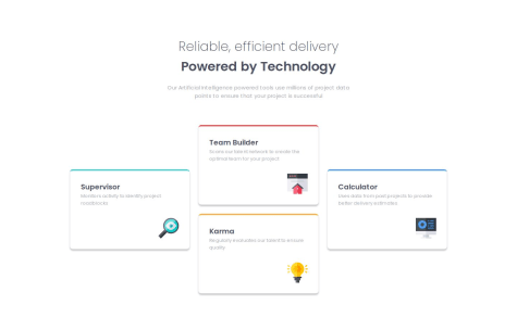
I think I've managed to get very close to the original design.
What challenges did you encounter, and how did you overcome them?Coding this solution was fun and I'm happy with the result.
What specific areas of your project would you like help with?I'd love to get feedback on this solution!
Hi Paulo,
Excellent job on implementing this design.
For future projects involving grids, you might consider using the grid-template-areas property. It can help adjust the card layout across different breakpoints before switching to the mobile view.
grid-template-areas:
    "card1 card1 card2 card5"
    "card3 card4 card4 card5";

  @media (max-width: 68.75em) {
    grid-template-areas:
      "card1 card1 card2"
      "card5 card5 card5"
      "card4 card4 card3";
  }

  @media (max-width: 56.25em) {
    margin-top: 5rem;
    grid-template-areas:
      "card1 card1"
      "card2 card3"
      "card5 card5"
      "card4 card4";
  }

  @media (max-width: 32.5em) {
    margin-top: 5rem;
    grid-template-areas:
      "card1 "
      "card2"
      "card3"
      "card4"
      "card5";
  }
Great solution Josef
This project was a good opportunity to learn Sass. I also considered responsive design using rem instead of px and using logical properties.
Hey Leonard,
Nice job using Sass for this challenge! It's pretty cool.
You might want to try out BEM for naming your HTML classes too. It works really well with Sass.
I also gave Sass a shot for this challenge. I'm still learning it, but it's been fun to use.
Hello Chris,
Your design appears flawless, even with the use of pixel-perfect precision.
Just a quick suggestion: instead of using modifier classes (e.g., .entity) for bottom margins, try leveraging Flexbox with the gap property. It simplifies spacing and gives better control over layouts. Also, consider placing utility classes after the main class (e.g., class="instructions entry") and using more descriptive class names for clarity and maintainability.
Hope this helps! Still learning myself, but thought I’d share.
Hi João,
Great job on the HTML semantics! The structure looks good from my perspective. For future improvements, consider refining your class naming with the BEM methodology or any other approach you prefer. It ensures clarity and consistency in your code.


