


P
ApplePieGiraffe• 30,545
@ApplePieGiraffe
Posted
Hey, Aiaru Mukhamedyarova! 👋
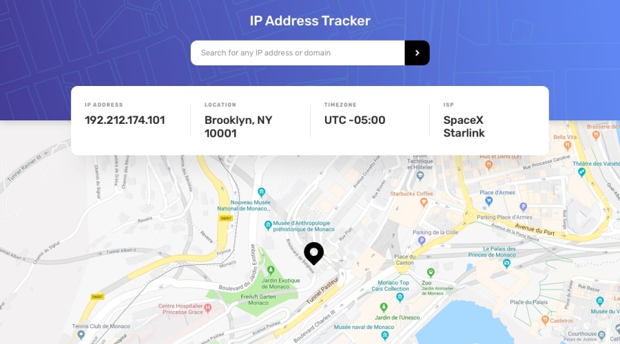
I just wanted to say that I really like the touch of glassmorphism that you added to the design of this challenge! 😀 The only issue I see is that some of the text inside the information box isn't so readable because of the map showing through the background of that container. It might be worth changing the color of the text to something darker or finding some other solution to increase the contrast between the text and the background so that it is easy for all users to read. 😉
Hope that helps. 🙂
Keep coding (and happy coding, too)! 😄
Marked as helpful
1
@anapimolodec
Posted
@ApplePieGiraffe Thank you so much for your kind review~~ It is really helpful, noted!
1

