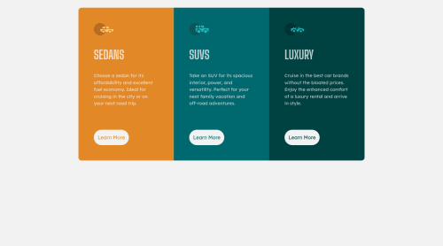
3 Columns Preview Card Component

Solution retrospective
Hi! Here's my latest challenge. I tried using rem instead of px for font sizes and used css grid for the layout. I don't understand why the <main> is so long though. Any ideas are welcome! Let me know what you think. Thanks!
Please log in to post a comment
Log in with GitHubCommunity feedback
- @PhoenixDev22
Hello Lorenzo,
Great work!I have some suggestions regarding your solution:
HTML
-
About <h1> it is recommended not to have more than one h1 on the page . Multiple <h1>tags make using screen readers more difficult, decreasing your site’s accessibility. You can add a <h1> with class="sr-only" (Hidden visually, but present for assistive tech). Then you can use <h2> instead of those <h1>.
-
For any decorative images, each img tag should have empty
alt=""as you did andaria-hidden="true"attributes to make all web assistive technologies such as screen reader ignore those images . In this challenge , all the images are decorative. -
Don't capitalise in html, let css text transform take care of that. Remember screen readers won't be able to Read capitalised text as they will often read them letter by letter thinking they are acronyms.
-
Imagine what would happen when the user click those
learn more? Clicking those"learn more"would likely trigger navigation not do an action so button elements would not be right. So you should use the<a>.
And it is essential that interactive elements have
focus-visiblestyles as well as hover styles. These need to be really clear and obvious as they are needed to help a keyboard user know where is focused on the page.CSS
-
border-radiusandoverflow hiddento the main container that wraps the three cards so you don't have to set it to individual corners. -
In order to center the card on the middle of the page , you can use the flex or grid properties and
min-height: 100vhto the ``<body>`. Add a little padding to the body that way it stops the component from hitting the edges of the browser. -
Consider using
min-height: 100vhto the body, that will let the body grows taller with the component outgrows the visible page. -
Check the responsiveness again.
-
310px;an explicit width is not a good way . instead of setting so many widths for individual cards in this, consider using max-width to the main container . That will let the component grow up to a point and be limited.
/* 601px is too  early to change  the desktop layout, */
@media only screen and (min-width: 601px)
.grid {
    Width: 100%;
    max-width: 930px; /* should be in rem */
    grid-template-columns: 1fr 1fr 1fr;
    grid-template-rows: none;
}
Aside these, your solution is good. Hopefully this feedback helps.
Marked as helpful -
- @LozPilafas
Hey!
I think its really good , you could improve it to match the brief by making it mobile friendly:
correct media query to snap when the width is too small correct edge rounding when stacked
(created a pull request to see the suggested code in github)
peace


Join our Discord community
Join thousands of Frontend Mentor community members taking the challenges, sharing resources, helping each other, and chatting about all things front-end!
Join our Discord