


Design comparison


Solution retrospective
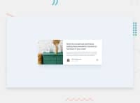
Challenge done! This literally challenge me especially in the making of the content horizontally after I made the mobile view. I tried to change properties to fit the image in its parent container but it was already fit. The problem is the padding from the second content that made space in the top and bottom of the image container. So I just came up with a solution of scaling up and aligning the image container to get rid of the spaces but somehow it affected the overflowing share icons even though the image container is overflow hidden, because the share icons needed to overflow the article card. And that is how I made the challenge.
Community feedback
Please log in to post a comment
Log in with GitHub
Join our Discord community
Join thousands of Frontend Mentor community members taking the challenges, sharing resources, helping each other, and chatting about all things front-end!
Join our Discord