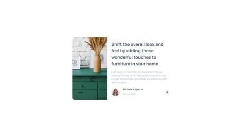
Article-preview-component

Solution retrospective
Tooltip and Footer Behavior Implementation: Summary & Notes 🧩 Problem Overview The task involved implementing a tooltip display on desktop and a footer transformation on mobile view as part of a social sharing UI component. The functionality is somewhat similar to a classic responsive navigation menu — for example, a hamburger button that reveals a sidebar menu on smaller screens.
✅ Approach It was decided to delegate only the toggling logic to JavaScript, which simply updates the data-share attribute on the footer element. JavaScript answers the question “what should be displayed?”, while the UI layer (CSS) answers “how should it look and behave?”.
The UI is fully responsible for deciding which layout to show based on the screen size. Two distinct views are implemented:
A tooltip-style popup shown above the share button on desktop.
A footer replacement view shown on mobile.
This separation is clean, intuitive, and aligns well with modern responsive design patterns.
⚠️ Limitations & Accessibility Consideration What was not implemented in this task is ARIA accessibility management. Specifically:
The aria-hidden attribute is not updated dynamically to reflect visibility changes.
This may affect screen reader support and accessibility tree clarity.
Proper aria-hidden, role="tooltip" usage, and keyboard navigation handling could be considered for future improvement.
Please log in to post a comment
Log in with GitHubCommunity feedback
No feedback yet. Be the first to give feedback on o-k-harmash's solution.
Join our Discord community
Join thousands of Frontend Mentor community members taking the challenges, sharing resources, helping each other, and chatting about all things front-end!
Join our Discord