blog-preview-card

Solution retrospective
I’m most proud of my growth in building clean, accessible, and maintainable UI components using semantic HTML and modern CSS techniques. One particular project that stands out is when I developed a modular blog preview card system. It wasn’t just about making it look good — I applied best practices like using custom properties for theme consistency, logical properties for i18n support, and flexible layout patterns like Flexbox and Grid.
What made me especially proud was not just delivering a polished UI, but also making it easy for other developers to reuse and scale it. That balance between design and engineering is something I really value.
I designed the layout with a mobile-first approach and implemented two breakpoints — one for mobile and one for larger devices — which worked well for the core experience. However, next time I’d add an additional breakpoint for mid-sized devices like tablets or small laptops. I realized that the transition between mobile and desktop wasn’t always smooth, and having a dedicated breakpoint for those in-between sizes would make the design more flexible and visually consistent across a wider range of screens.
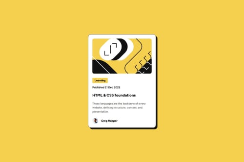
What challenges did you encounter, and how did you overcome them?One of the main challenges I encountered was getting the illustration image to properly fit its container inside the <figure> element. Initially, the image wasn’t respecting the container’s border radius and was leaving unwanted space on the right side, which disrupted the visual balance of the card layout.
I realized the issue was due to the image’s default inline behavior and missing sizing constraints. To fix it, I applied display: block, set the image’s width and height to 100%, and used object-fit: cover to ensure it filled the container without distortion. I also made sure the parent <figure> had overflow: hidden and the correct border-radius applied. These adjustments made the image scale correctly and align with the card’s design intent.
What specific areas of your project would you like help with?I’d appreciate help with refining the responsiveness of the layout across a wider range of screen sizes — particularly mid-range breakpoints like tablets. Since I only implemented two breakpoints (mobile and large screens), I’d like feedback on how to better handle scaling and spacing in that in-between range.
I’m also open to guidance on accessibility best practices, especially around semantic HTML and how to improve keyboard and screen reader support for interactive elements. Lastly, any tips on structuring CSS more efficiently for scalability and reusability would be valuable as I continue building out components.
Please log in to post a comment
Log in with GitHubCommunity feedback
- @GregorDeCillia
Nice work!
One thing you might try is to use
clamp()for the medium screen sizes. I just completed this challenge and instead of breakpoints I used this.body { font-size: clamp(12px, 3.82vw, 16px); }It makes it so all
emunits scale linearly for mid-sized screens and have a fixed min and max.

Join our Discord community
Join thousands of Frontend Mentor community members taking the challenges, sharing resources, helping each other, and chatting about all things front-end!
Join our Discord