


@grizhlieCodes
Posted
- Interesting question with the paddings. Whilst I prefer using media queries in most cases I have dabbled in using
padding: clamp(min, preferred, max)in a few projects.
I think clamp is still underutilised by most people. It basically allows you to set a minimum value, a preferred value (this is where the magic happens) and a max-value.
The preferred value is usually a mixture of rem + vw. The vw will of course be different as the screen gets smaller/bigger hence it is our responsive value.
I have 2 resources for you:
-
Video by Kevin Powell, skip to the clamp bit. Most videos push about clamp being for fonts only (or specifically), not true. It can be used for lots of things, especially where
widthis concerned. -
Once you've watched the video and played around with clamp, perhaps in codepen, use this tool to get the EXACT clamp values you need.
-
As for the background-image question: Background image isn't the worst idea. But you could opt for containing the image within HTML instead and using
object-fitandobject-positioninstead. Background image is useful when the heights/widths are predefined (I think). So opting for a HTML solution might be beneficial in this case. Here is a small demo I built.
Then you can position this absolutely perhaps to the main 'top' container or something along those lines?
-
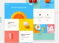
I think even this design should have a max-width, perhaps the standard 1440px or even smaller. I have a 49" display and whilst testing how the image stretches may seem fine, it is pointless. The user should not look so much in between left and right to see the text/images below.
-
I think your HTML structure can be a bit improved. Something like this:
<header>
</header>

<main>

     <section class="hero">
</section>

     <section class="calls-to-action">
</section>

     <section class="services">
</section>

     <section class="testimonials">
</section>

</main>

<footer>
</footer>
Hope this was somewhat helpful!
Marked as helpful
@shizukaayane
Posted
@grizhlieCodes Thanks so much for your response. (Sorry it took me so long to respond 😌)
Your response is really helpful. The clamp() would be a great solution, maybe I'll try it in other project.
For the background image I thought about doing it with the standard img element but this seemed to be the perfect time to use the css background image (also because I haven't used it quite as much and wanted to try it out).
As for the max-width, I completely forgot that other people can have wider monitors 😅. And also with the background image it wouldn't look that good with single color background maybe, but that's just how it goes with wide monitors I suppose.
I'll try to improve on my HTML structuring skills going forward. 💖
@grizhlieCodes
Posted
@shizukaayane I know exactly what you mean with the whole background image/single color issue.
Truth be told that is a problem with the design, not any code we might want to apply. Designers should think of these things way ahead of time and I suppose most of the time they don't need to due to the rather simple nature of most websites.
Some more crafty ones solve these challenges in interesting ways though, although I can't think of a great example at the moment...
Hope you enjoy clamp once you get used to it, it's an awesome tool at our disposal😁

