


Diarrah• 3,418
@Diarrah
Posted
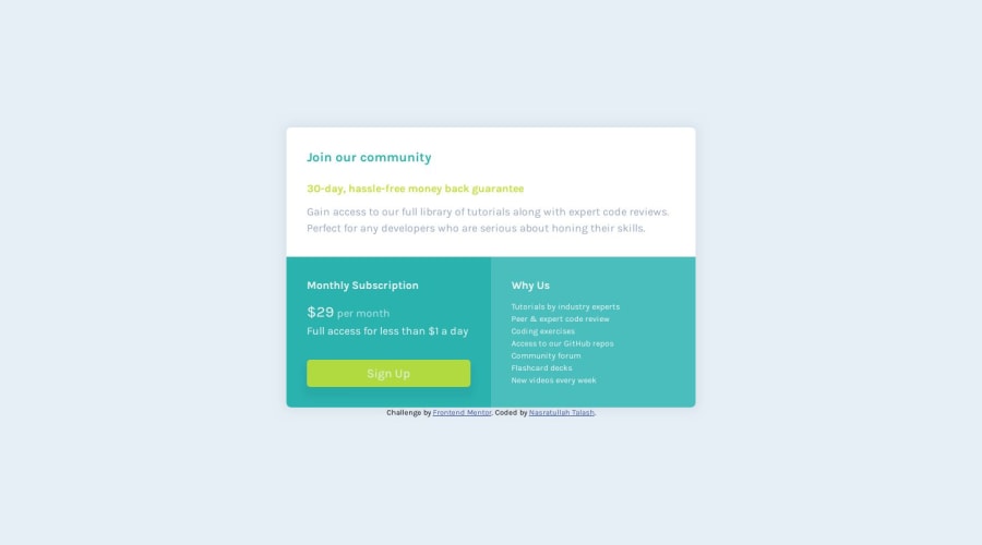
Pretty spot on so nice job on that!
Looking at your code, I would take out all that unnecessary CSS. And one more small thing: add a cursor:pointer for your button so that it's more obvious that it's a call to action.
1

