Four Card Feature Section

Solution retrospective
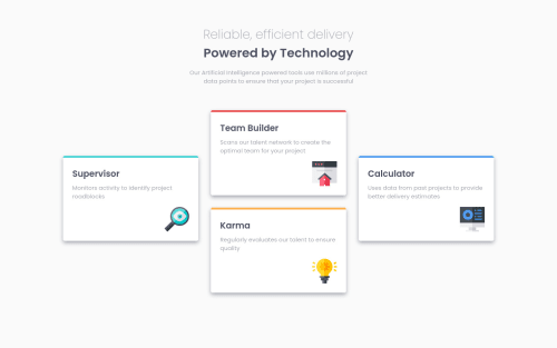
In this challenge, I mainly used grid for responsiveness. I made three layouts: desktop, tablet, mobile. And I started with mobile layout first. In the last part, I am not happy with my code that I have to use top: 25% to centre a div. How can I use other ways like align-item: center to center that. Feedbacks are warmly welcomed.
Happy Coding!
Please log in to post a comment
Log in with GitHubCommunity feedback
- @BikeInMan
Hi,
Nice work with 2X2 on tablets. Regarding your question. You can remove
top: 25%;on supervisor and calculatorand just add the
align-items: center;to.feature-sectionLet me know if it works out.
You can make this challenge more interesting by adding some interactivity to the cards like a hover effect and also making each card a link. They are supposed to lead somewhere, right? Good Luck.
Marked as helpful - @K4UNG
Hey! Good job on this challenge. Another great way you could use to get this centered layout would be to have 4 grid rows and giving the cards 2 rows each at exactly where you want them to be using
grid-area-templatesor justgrid-row/column. Happy Coding!


Join our Discord community
Join thousands of Frontend Mentor community members taking the challenges, sharing resources, helping each other, and chatting about all things front-end!
Join our Discord