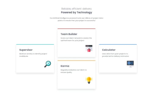
Four Card Feature Section

Solution retrospective
I am most proud of matching the design to the original. While uncertain what I would do differently next time, I would like to explore a different and potentially more efficient way to lay out the cards.
What challenges did you encounter, and how did you overcome them?One challenge I encountered was figuring out how to lay out the cards effectively. After exploring different approaches, I realized that using CSS grid would be the best solution. Since I had little knowledge of CSS grid, I briefly researched how it works, specifically focusing on grid-template areas, and then used position and bottom to align the left and right cards vertically in the center.
What specific areas of your project would you like help with?Any feedback is welcome.
Please log in to post a comment
Log in with GitHubCommunity feedback
- @Xaramson
beautiful work and very nice attention to detail

Join our Discord community
Join thousands of Frontend Mentor community members taking the challenges, sharing resources, helping each other, and chatting about all things front-end!
Join our Discord