


Hi @Drallas,
I don't think you should be making the whole page a grid, just the four cards.
At the moment, you've put your header on the grid, but then given it a width that makes it bust out of its grid item. So there's no reason for it to be in the grid at all. The widths are problematic in several ways:
- header has a narrower width than the width on the paragraph inside it. That makes the paragraph off center
- if these weren't in the grid, you'd have no need to give them a width anyway
- I would recommend giving the paragraph only a max-width in
ch
I can't figure out what's causing all the horizontal scroll on this. A bit baffled there. Have you got some transforms going on somewhere or negative units pulling elements to the side?
I was about to give feedback on the grid, as that's what you've asked about, but I think there's wider issues that need looking at here to be honest. I'll try to give you some tips and then look again on Monday if you've been able to amend, hope that's ok.
- remove all relative positioning (and absolute if there is any in here), and remove any top/right/bottom/left values along with it
- remove all widths (and heights if there are any) everywhere in this solution.
- wrap a container around your 4 cards and make that display grid
- keep your current container too, but no display grid or any values on it apart from a little padding and a max-width
- make the body
min-height: 100vh; display: grid; place-content: center - remove all margin widths and heights from the cards. Give them some padding
- think about how else to position those icons. They could be background images, they could be positioned absolutely, they could be displayed block with margin auto left...
- those icons don't need alt text. So if you do include them in HTML instead of making them background images, use
alt="" aria-hidden="true" - just noticed you've split the page title into 2 headings. That's all one h1. Use spans or a strong tag inside to style it
- font sizes are too small - especially in the cards. Font size should always be done with rem/em not px.
- In fact, when you do have to add things like widths, it's best to use rems too, so they scale with the text
- I'd use grid for this for all screen sizes, not just huge screens
- bring in a media query and layout change much earlier than you are at the moment
- use grid-gap
I hope all this helps! Good luck
@Drallas
Posted
@grace-snow Thanks a lot Grace enough to refactor it. My Huddle also needs some refactoring so I'll be doing refactoring this weekend.
Your review is quite extensive and it might generate additional questions, I guess I start with the 'low hanging fruits' before i tackle the rest.
One tip I struggle the understand: "remove all widths (and heights if there are any) everywhere in this solution." no idea yet how to get the cards to be sized correctly without..
@Drallas that's what grid template rows and grid template columns are for. The whole point of grid is you can declare it at a top level and then place the children where you want on the defined grid
@Drallas
Posted
@grace-snow
Hello Grace Thanks again for your excellent feedback I learned a lot correcting the solution. I've tried to address all the point you brought up, it's a bit late now but I try to step through it.
I can't figure out what's causing all the horizontal scroll on this. A bit baffled there.....
- was caused by : margin-right: -50%; on .attribution
The header has a narrower width than the width of the paragraph inside it. That makes the paragraph off centre.
- I removed the width on the paragraph, it's centred now.
- I also removed the width except on the paragraph I had to set 50ch to make it brake at the 'Data' word.
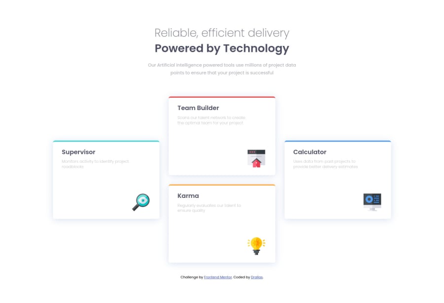
just the four cards in the Grid
- Placed the header outside the grid. This was the first time that is used The Grid System, I'm still discovering what the best practices are.
Wrap a container around your 4 cards and make that display grid.
- Done
Keep your current container too, but no display grid or any values on it apart from a little padding and a max-width
- Done .grid-container
use grid-gap
- i had set gap seemed to work but changed it to grid-gap. according to MDN it's called Gap https://developer.mozilla.org/en-US/docs/Web/CSS/gap
I'd use grid for this for all screen sizes, not just huge screens
- agreed done
remove all relative positioning (and absolute if there is any in here), and remove any top/right/bottom/left values along with it.
- Done
remove all widths (and heights if there are any) everywhere in this solution.
- Done
(remove all margin widths and heights from the cards. Give them some padding)
- Done
make the body min-height: 100vh; display: grid; place-content: center.
- Done
think about how else to position those icons. They could be background images, they could be positioned absolutely, they could be displayed block with margin auto left...
- Done as Block
those icons don't need alt text. So if you do include them in HTML instead of making them background images, use alt="" aria-hidden="true"
- Done
just noticed you've split the page title into 2 headings. That's all one h1. Use spans or a strong tag inside to style it
- Used divs now
font sizes are too small - especially in the cards. Font size should always be done with rem/em not px.
- Checked the figma again an converted values to rem.
bring in a media query and layout change much earlier than you are at the moment.
- Check
@Drallas you can't use a div instead of a h1. H1 is probably the most important element on a page, used by search engines and assistive tech users to know what the page is.
Also, text should never only be in a div or span. It has to be in a semantic element

