


@fraserwat
Posted
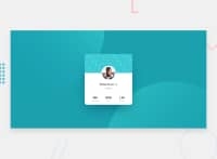
Hey, congrats on your first challenge! 🎉
There's a few things I think could make this a little more responsive.
-
instead of having the two background images in div's I reckon you'll have an easier time with it if you have them as
background-imageattributes of thebodyelement, and do the positioning invhandvwmeasures instead of percentages. You'll then be able to get rid of the @media queries there. -
You'll want to do max-widths to stop things getting too wide, but generally you won't want to be dictating widths and heights, so its more flexible on different screen sizes. You should be able to sort most of this stuff out with margin and padding. When your total screen width approaches the width of the element, it should shrink (leaving a bit of a gap with
margin).
