


@brasspetals
Posted
Hi, RocTanweer! 👋
-
The layouts at specific media queries look great, and you’ve clearly put in a lot of thought into them. Ideally, however, your solution would look good on all screen sizes, not just a handful of set widths. I would suggest in future projects to focus on responsive design. I see you’ve used a bit of Flexbox, which is great! I encourage you to dig deeper into it, as it’s great for responsiveness. Grid is also really good, but I’d learn one at a time as to not get yourself too confused in the process. Here’s a really nice resource for Flexbox that also has some great links at the bottom of it. For image responsiveness, I’ve found a width percentage combined with a max-width usually works pretty well. The
object-fitproperty can also be really useful. There’s alsopictureandfigureelements, although I still have a lot of learning to do about those myself. 😄 -
Another great resource is this admittedly long article on semantic html. I refer back to often, and I’ve found it really helpful for my projects.
-
For the errors in your report, adding
titletags inside the svg of your social icons should clear them up. Here’s an example:
<a href=“#”
      <svg…
        <title>instagram</title>
         <path>…
I realize this feedback isn’t picking out specific elements, but I hope it’s still helpful! Happy coding!
@RocTanweer
Posted
@brasspetals I really appreciate your words.... It's really helpful 😉 I will try learning as many resources you have given as possible! Happy coding
@RocTanweer
Posted
@brasspetals Would you please show code snippet here relating to image responsiveness please....I couldn't understand what you said up there 🙏
@brasspetals
Posted
@RocTanweer I’ll see if I can explain the responsiveness a bit better or at least show some examples.
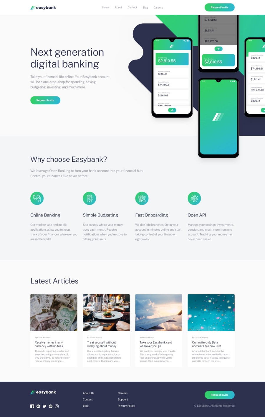
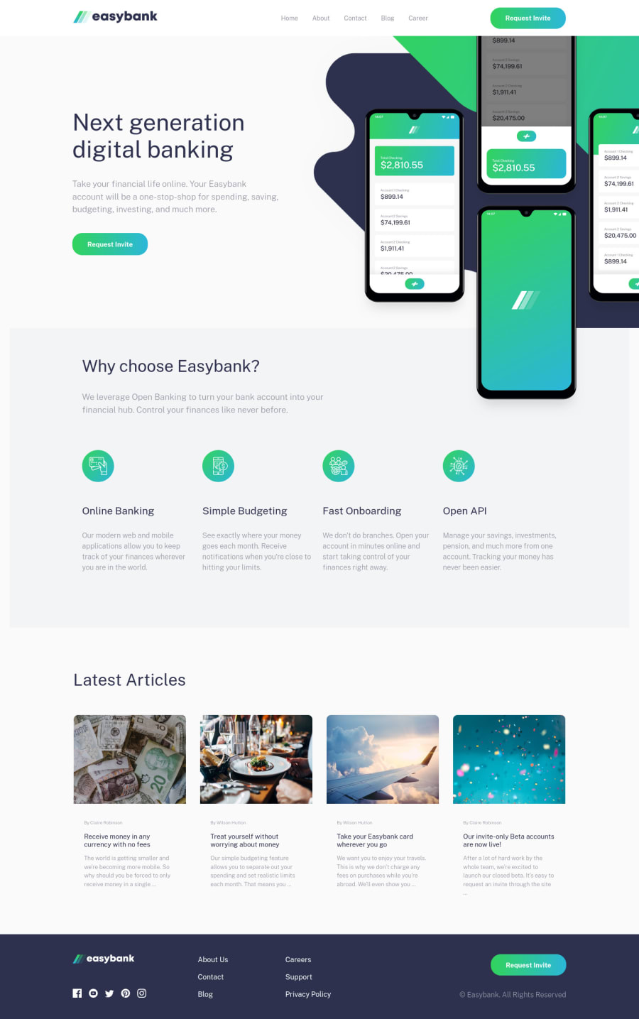
Let’s look at the hero image on my Easybank solution . On the desktop version (800px and above) the .hero__img img has a width: 119% and a max-width: 767px (that’s what the weird rem value works out to, and is the width of the image-mockups.png). This allows the width of the image to be responsive, but stops it from getting larger than 767px. That’s what I meant by using a combination of width with a percentage and a max-width.
You could also take a look at the hero image of my Insure solution. For the mobile layout, I used the following code (I used the class “intro” instead of “hero”):
.intro__img img {
width: 100%;
max-height: 45.1rem;
object-fit: cover;
object-position: 50% 43%;
}
This was a rare instance when I wanted to limit the height of the image. It’s a good illustration of what object-fit: cover can do. I suggest playing around with all the properties and values in the dev tools to see what each does.
On the desktop layout, the parent div (.intro__img) gets absolute positioned, and I used a width percentage (width: 40% and then width: 48.75% in a later media query) to allow the image to respond with the page.
I know this probably wasn’t a good explanation, but hopefully playing around with the code in these examples will help a little.

