


@pikapikamart
Posted
Hey. Great work. Regarding your query
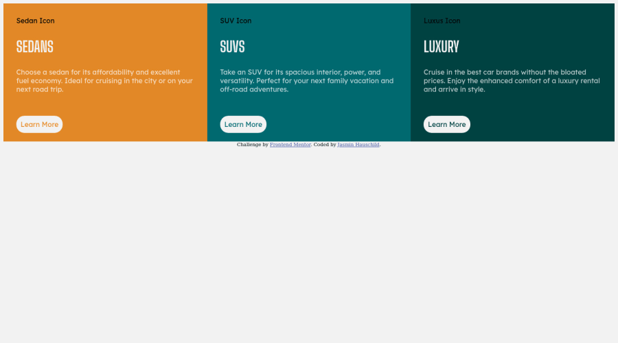
- As far as I can see, your learn more is at the end of the card. Are you referring for it to be at the right side of the container? If that is the case
margin-left: autowill place your learn more at that side. But is that want you want?
Also suggestions would be that.
-
I think it will be better if you make a github repository for your work. This will be really good since you can submit you live site in here, and that is totally free.
-
Your learn more is supposed to be a link right? So instead of using
divon that, it will be better if it isatag. Just to make our markup more semantic. -
As I resize for mobile view, the width of the cards overlaps the body's width, so an unwanted scrollbar appears at the bottom which we always want to avoid. Adjusting the breakpoint on that will be really awesome.
-
Multiple usage of h1. Using multiple h1 in a single page is not recommended and we want to avoid multiple usage of it. You use only 1 h1 per page. Changing them to h2 something like that will be better.
-
Images. The image as well is not loading properly. This will be really awesome if you setup what I mentioned, a github repository for you to place them.
That is all, if you need help in those mentioned above, feel free to drop your queries in here okay^
@Jash005
Posted
Thanks for your feedback. I've improved these little things.
