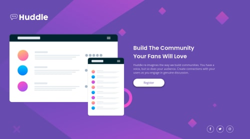
Huddle responsive landing page with flexbox

Solution retrospective
New to HTML/CSS, I'm sure this is probably messy and there are better ways to do this. Still working on the accessibility/ HTML issues, if you have suggestions I'd love to hear them, thanks!
Please log in to post a comment
Log in with GitHubCommunity feedback
- @pikapikamart
Hey, great job on this. It would be a lot easier if you deployed this on github pages, that way we could inspect the layout easier. But still, the layout in desktop looks fine and mobile as well.
Some suggestions would be:
- The
imgfor the website-logo should have usedalt="huddle"as an attribute, the image already has the text so better using it as thealtvalue. - The
altfor the image in the hero-section should be usingalt="". Also, when you useimgelement, always use thealtattribute. If the image is just decoration, usealt=""on it, but if the image adds content, then use a meaningfulaltvalue, always have thatalt. - I think the
registerwould be a lot great if it was an anchor taga, since there aren't any modal popups on this one wherebuttonis used. - The
atag that wraps each social media link should havearia-labeland the value of that attribute is the name of the social media. For example, theatag that wraps the facebook icon should be:
<a href="facebook.com" aria-label="facebook" />`This way, users will know where this link would take them. Use them on the other
atag as well. You use this attribute, if the element have no text-element inside it.Aside from those, great job again on this one.
Marked as helpful - The
- @lesego16
- Try fixing ACCESSIBILITY ISSUES and HTML ISSUES


Join our Discord community
Join thousands of Frontend Mentor community members taking the challenges, sharing resources, helping each other, and chatting about all things front-end!
Join our Discord