


@pikapikamart
Posted
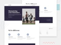
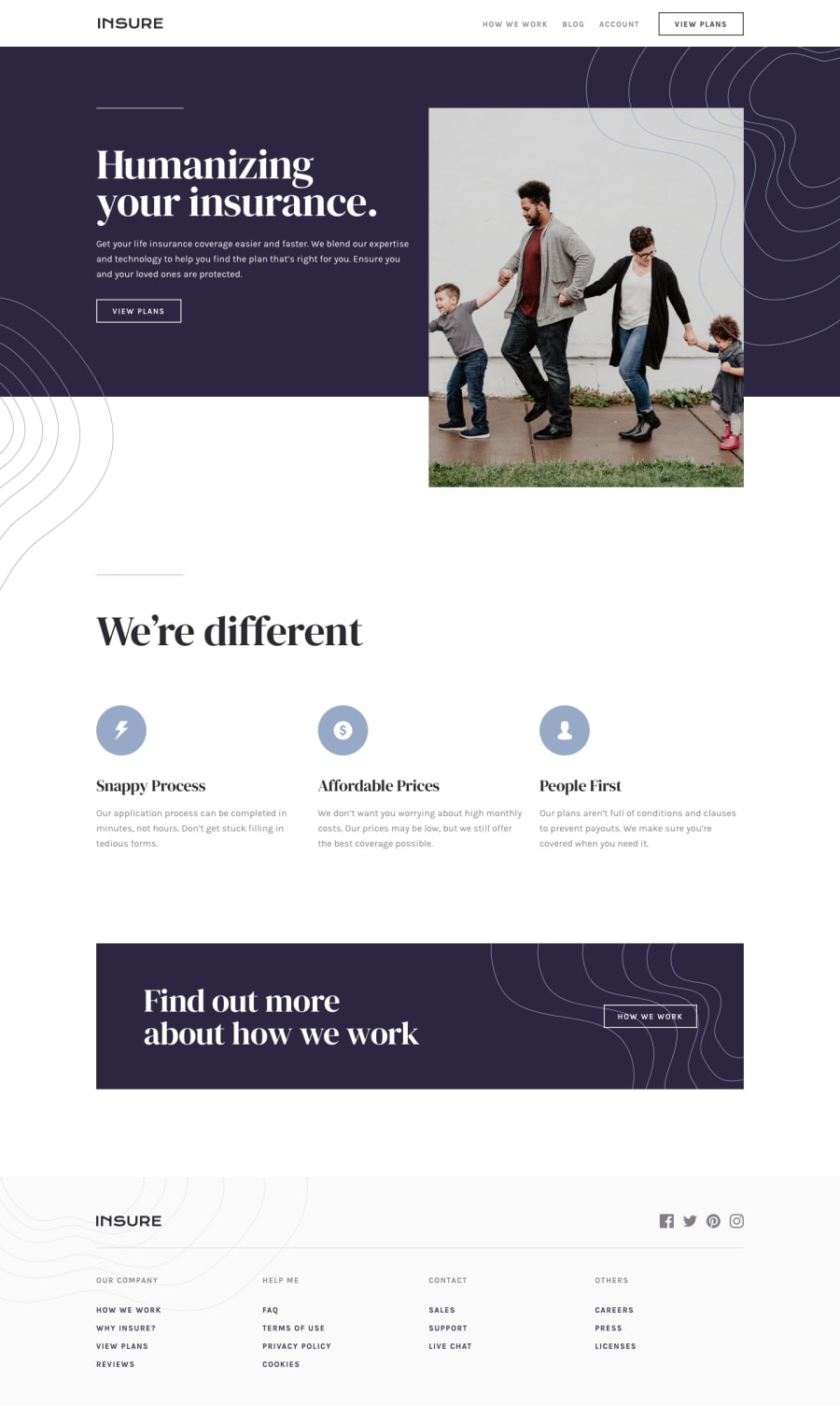
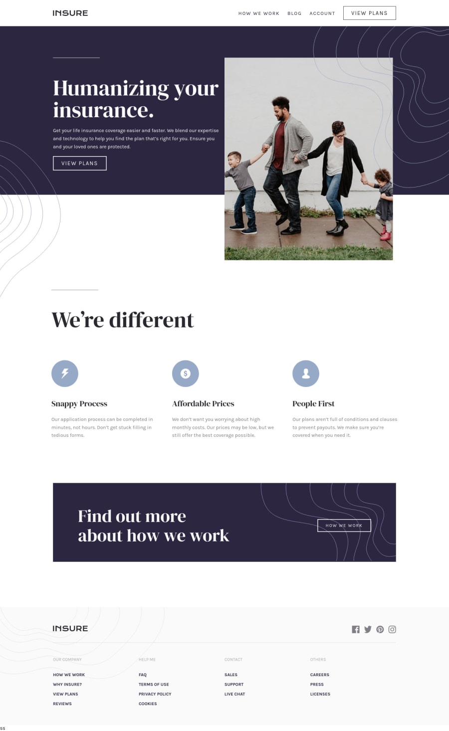
Hey, great work on this one. Desktop layout looks fine but the hero-text on my end is being on top of the hero-image. I am using a 1366x768 monitor. The site at the moment is not responsive because if you go for like 530px upwards, the content on the site is not responding well, thus being hidden by the screen and creating horizontal scrollbar. Mobile layout looks fine but there is still a horizontal scroll and your breakpoint of 375px is too little for a mobile phone. Some phones have higher width on that one, the 375px on the design is not related to the breakpoint, adjusting it would be really great.
Some other suggestions on the site would be:
- For this, the preferred markup would be:
<header />
<main />
<footer />
This way, all content of your page will be inside their own respective landmark element. Using header and footer inside the main tag does not renders it as a primary landmark so using them outside it would be really great.
- Remember that a website-logo is one of the meaningful images on a site so use proper
altfor it. Use the website's name as the value likealt="insure". - Those 4 links could have been wrapped inside a
navsince those are your primary navigational links:
<nav aria-label="primary">
  <ul>
    list of links in here, 4 links
  <ul>
</nav>
I used aria-label="primary" on this nav since I prefer to use another nav on the footer as well. Using the attribute makes the landmark unique.
- The hero-image could have used a more descriptive
altsince it looks like a meaningful image on the site. Always be descriptive when you are usingalttext on an image. - Also, when using
imgtag, you don't need to add words that relates to "graphic" such as "image" and others, sinceimgis already an image so no need to describe it as one. - Those lines-images, you could have used them as a value for
backgroundproperty instead of using animgtag for it. This way, markup will be much clearer since there are no extra tags. - When using
atag, always add thehrefattribute on it otherwise theatag will not function properly. Check your usage ofatag on the site. - Those 3 icons that you used could have used an extra
aria-hidden="true"attribute alongside thealt=""so that they will be totally hidden for screen-reader users.
FOOTER
- Same with the company logo, use a more proper
altvalue. - Those social-media links could be inside a
ulelement since those are "list" of links. - Each
atag that wraps the social-media icon should have eitheraria-labelattribute orsr-onlytext inside it, defining where the link would take them. For example, you should usefacebookas the value if the link would take the user to facebook. - Social-media image should be hidden since it is only a decorative image so use
alt=""andaria-hidden="true". - On those 4 columns of links, I would suggest to use
navinstead ofdivfor the.footer-nav-listselector since those links are still the website's navigational links and there no external links that are used in there as well so it is fine to usenav.
MOBILE
- Hamburger menu should be using a
buttonsince it is an interactive component.
SUPPOSING BUTTON IS USED
-
The hamburger
buttonshould have a default attribute ofaria-expanded="false"and it will be set totruewhen the users toggles it and vice-versa. -
The hamburger
buttonshould have eitheraria-labelattribute orsr-onlytext inside it which defines what thebuttondoes. You could usearia-label="navigation dropdown menu" -
The
imginside the hamburger-menu should have been hidden since it is only a decorative image. -
Lastly, just making the site more responsive for all sizes :>
Aside from those, great job still on this one.
Marked as helpful
