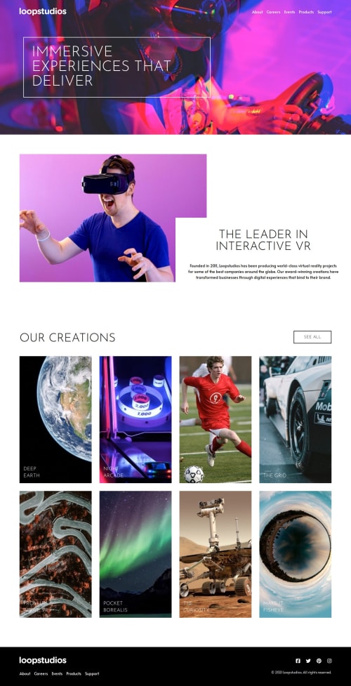
Loopstudios homepage

Please log in to post a comment
Log in with GitHubCommunity feedback
- @codi-Andre
Your code looks good! Your solution is very close to the design.
You can improve in some areas, here are some of my suggestions:
-
Your site does not have a width limit, in large screens it will continue to spread and break the design, container strategy allow you to specify a max width, take a look at tailwind documentation:
https://tailwindcss.com/docs/responsive-design -
Text above image has some accessibility issues, text needs consistent contrast, to see some examples of what I am talking you can check my solution. Here are some tips you can try:
- Add an overlay
- Lower the image contrast
- Colorize the image
- Add a text shadow
- Add a cursor style to interactive elements, it's something already familiar to users and help them know which elements of the page are clickable:
className="cursor-pointer" # or .any-button, .any-link { cursor: pointer; }Marked as helpful -
Join our Discord community
Join thousands of Frontend Mentor community members taking the challenges, sharing resources, helping each other, and chatting about all things front-end!
Join our Discord