


@ApplePieGiraffe
Posted
Greetings, Vanessa Martin! 👋
Nice to see you complete yet another challenge! 😀 Good work on this one! 🙌 Your solution looks pretty good and is responsive! 👍
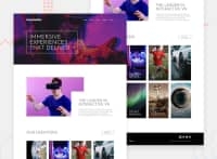
I noticed that the navigation links and the social media icons in the footer of the page jump up a bit when they are hovered over. I think this is because of the bottom border that is added to them upon hover. You can make the hover state of those elements smoother by adding an invisible bottom border and then changing the color of that border to white when they are hovered over. That way, the links and the icons will remain in their place and not be moved upwards when the bottom border is added. 😉
Besides that, I just suggest allowing the background of the hero section of the page to expand with the width of the page in the desktop layout so that there is no empty grey space to the sides of the image when the width of the page increases.
Keep coding (and happy coding, too)! 😁
@vsm1996
Posted
Hey APG!
Thank you so much for your continued encouragement! I have added your suggestions to the site (I ended up giving the body a max-width to fix the hero image issue as well as problems with the content layout). I will definitely need to remember the trick for making sure this particular hover state is smoother as well. 😄
On to the next challenge! ✨
@ApplePieGiraffe
Posted
@vsm1996
Awesome! Good luck with your next challenge! 👍
