


@emestabillo
Posted
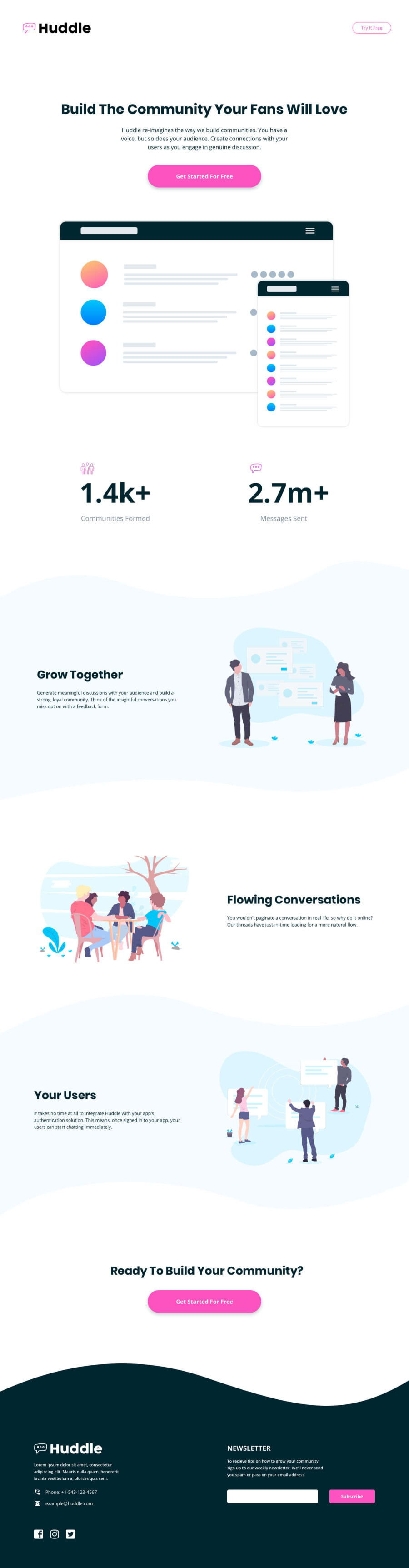
Hi @minibrusp, this looks good congrats! I like that you took great effort to keep the images and waves responsive. Here are a few thoughts:
-
I'm curious to know why
asidewas used for the call-to-action section. It's usually applied to a sidebar or as the definition suggests, it's content is indirectly related to the body. -
Interesting hover states as well, the major buttons appear the same color as the main text. I think it'd better if it's a color that's closely related to the theme of the project, like the one in
nav -
Phone and email have hover states, but missing
cursor: pointer. The form button has the opposite issue.
Hope this helps!
@minibrusp
Posted
-
i used aside cause i was thinking the content can stand alone and still adds interest on the user but if im wrong can u suggest me a better way to tackle this part.
-
ill keep this in mind thanks.
-
i was kinda aiming it to only add more readability but ill keep it in mind. i kinda wanted to avoid using the hover style cause it conflicts with the footer background thinking of it your suggestion about the hover button on nav could make sense. Thanks for the suggestion really helped me alot.
@emestabillo
Posted
@minibrusp I think section would be more appropriate for the cta, same as what you've used for the other containers. It's content is very much related to the body and is neither placed as a sidebar. For the buttons, one suggestion is that you can change the pink shade, either make it darker or lighter, when the user hovers on them.
@minibrusp
Posted
@emestabillo Thanks a lot for your pointers will be working in that. looking forward for more pointers in the future thanks. :D


