Not Found
Not Found
Not Found
Not Found
Not Found
Not Found
Not Found
Not Found
Not Found
Not Found
Not Found
Not Found
Not Found
Not Found
Not Found
Not Found
Not Found
Not Found
Not Found
Not Found

Submitted

Mobile First, SCSS, DOM manipulation

@iadefidipe

Desktop design screenshot for the Blogr landing page coding challenge

This is a solution for...

  • HTML
  • CSS
  • JS
2junior
View challenge

Design comparison


SolutionDesign

Solution retrospective


This is my 2nd project applying DOM manipulation. I learnt how to use the intersection observer property. The mobile dropdown and desktop nav functionality is not as perfect as i want it to be yet, so I will appreciate feedback on what i could do to make my script better.

I will appreciate feedback

Community feedback

@YannisHaismann

Posted

Hello first of all, really great job !

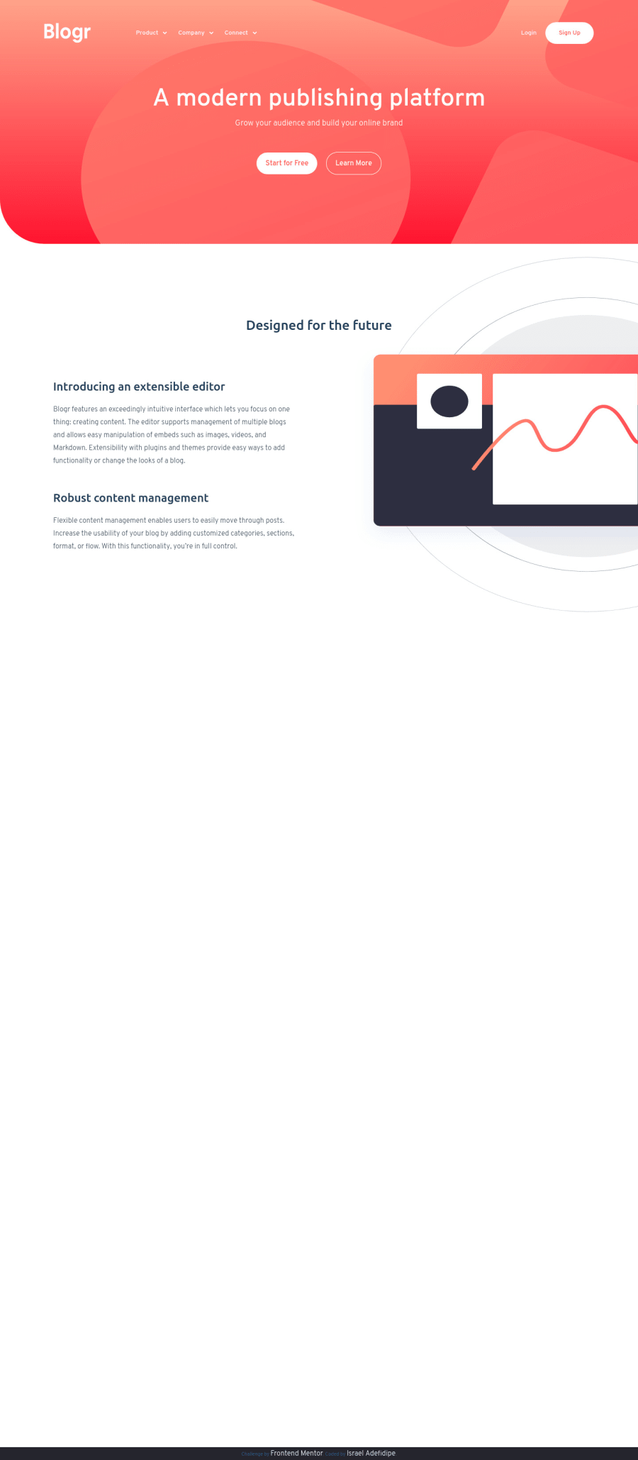
The website is responsive and work on phone and desktop that great but i have one problem. For my part i'm on a 21/9 screen and when the website is on fullscreen images are getting weird. Take a look on that.

And for the background of the header, i think you done a background linear top to bottom or something like that but try a left to right.

I'm french so sorry for my enflish.

Keep working on you code ! ;)

1

@iadefidipe

Posted

@YannisHaismann Thanks, I will work on that.

0

Please log in to post a comment

Log in with GitHub
Discord logo

Join our Discord community

Join thousands of Frontend Mentor community members taking the challenges, sharing resources, helping each other, and chatting about all things front-end!

Join our Discord