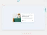
Not Found
Not Found
Not Found
Not Found
Not Found
Not Found
Not Found
Not Found
Not Found
Not Found
Not Found
Not Found
Not Found
Not Found
Not Found
Not Found
Not Found
Not Found
Not Found
Not Found

Submitted

Mobile first workflow using CSS flexbox

@iulian-cenusa

Desktop design screenshot for the Article preview component coding challenge

This is a solution for...

  • HTML
  • CSS
  • JS
1newbie
View challenge

Design comparison


SolutionDesign

Solution retrospective


Can someone help me with that popup ? I couldn't make it work. Also can someone suggest how to better improve my code and overall design of the page ? Thank you !

Community feedback

Tereza 605

@sirriah

Posted

Hello, don't use % for the width of elements. Watch this tutorial about units. It is better to use rems.

I see that you split css into the multiple files. I think, that it is not necessary in this small challenge. If you want to split, you should import the css parts into the one styles.css. And this one styles.css should be linked in the HTML file.

For me personaly is good to split the components, not the desktop/mobile/tablet view. So, make the component as a separate file, but put all media queries into this one file. It is more readable for another developers.

Happy coding!

Marked as helpful

2
darryncodes 6,430

@darryncodes

Posted

Hi Iulian

I'm about to start this project.

I'm going to base my solution to the pop-up around this article's JavaScript. However i'd use ES6 JS features, you won't need all the code and the CSS will have to be specific to this challenge but i think it does a good job showing how it might work.

Hope it helps!

Marked as helpful

1

Please log in to post a comment

Log in with GitHub
Discord logo

Join our Discord community

Join thousands of Frontend Mentor community members taking the challenges, sharing resources, helping each other, and chatting about all things front-end!

Join our Discord