


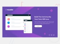
Design comparison


Solution retrospective
I'm still new to CSS. I'm curious if someone could scrub through my code and see if there's a more efficient way I could have used flex-box in this situation. I was having trouble setting heights for this project. I wanted it to take up the whole screen so I set the header to 20vh and the body to 70vh leaving 10vh for the icons at the bottom. I'm not sure if that's the best way to go about it so I would love input!
Thank you!
Community feedback
Please log in to post a comment
Log in with GitHub
Join our Discord community
Join thousands of Frontend Mentor community members taking the challenges, sharing resources, helping each other, and chatting about all things front-end!
Join our Discord