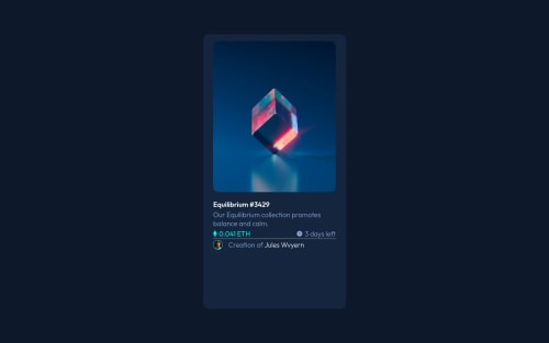
Submitted over 3 years agoA solution to the NFT preview card component challenge
NFT Preview Card with React.js
react

@UCSD-CodingCompadre
Solution retrospective
I am still having trouble with being consistent with sizing, this attempt I started with the mobile responsive design first and it seemed great but as soon as I started to work on the desktop part it didn't come out how I wanted it to again. I am just stuck on how to properly measure and style my projects so they are looking good no matter the display width and height.
Code
Loading...
Please log in to post a comment
Log in with GitHubCommunity feedback
- @adriandotdev
Hi Raul. I think you need to use flex for that also do not use other absolute units. try to use relative units for its responsiveness.
Also, you can use % for sizing the images like 100% etc.
Marked as helpful

Join our Discord community
Join thousands of Frontend Mentor community members taking the challenges, sharing resources, helping each other, and chatting about all things front-end!
Join our Discord