


@wendyhamel
Posted
Looks great on both of the design sizes.
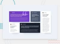
You could take it a step further to fix the sizes in between. Your layout switches to the desktop size from 379px screen width. The columns don't fit in the view untill around 680px screen width. From then untill around 1084px screen width the single column cards still have a very small width. From about 1225px screen width everything looks great again.
Small tip for centering the content on the page: you can make the main a grid and height: 100vh; and then center a div with your class container and it's content with: place-content: center center;.
You need to choose waht to do with the footer though, for example make it sticky to the bottom, or use flex on the body and flex-grow on main to push it down. Just two options I use often, depending on the project.
Marked as helpful
