Not Found
Not Found
Not Found
Not Found
Not Found
Not Found
Not Found
Not Found
Not Found
Not Found
Not Found
Not Found
Not Found
Not Found
Not Found
Not Found
Not Found
Not Found
Not Found
Not Found

Submitted

Planets Site - Eleventy, nunjunks, SCSS and ES6 modules

#accessibility
P
Daveā€¢ 5,245

@dwhenson

Desktop design screenshot for the Planets fact site coding challenge

This is a solution for...

  • HTML
  • CSS
  • JS
3intermediate
View challenge

Design comparison


SolutionDesign

Solution retrospective


BTW - The homepage is blank as this wasn't really included in the design. You'll have to click through to a page to see the content.

This was a big step up for me in terms of the tech used to build the site. Any comments or feedback would be most welcome. I put some details and questions in the readme, but I would really like to know:

  1. Is it OK to use inline styles to set custom properties? I did this using nunjunks and it worked really nicely, but I wasn't sure if this is really best practice.

  2. How to make individual HTML pages from a JSON object! I can see that 11ty's pagination should do this but I couldn't make it work!

Thanks for any other comments and feedback!

Community feedback

P
tedikoā€¢ 6,530

@tediko

Posted

Hello, Dave! šŸ‘‹

Congrats on finishing another challenge! šŸŽ‰ Your solution looks good and also responds well. I have also finished this project recently if you'd like to see. Here's my few tips:

  • I can scroll page when mobile menu is open. You should prevent scrolling by using helper class with overflow: hidden on the <body> element. (btw. now I've noticed that I've also forgotten about it! šŸ˜…)
  • Your anchor in tabs doesnt cover whole li element so when I use my keyboard to navigate my page the focus isn't covering whole element but just an anchor.
  • A small detail is to stick more to design when it comes to font-sizes etc. It seems big now :D

Good luck with that, have fun coding! šŸ’Ŗ

Marked as helpful

1

P
Daveā€¢ 5,245

@dwhenson

Posted

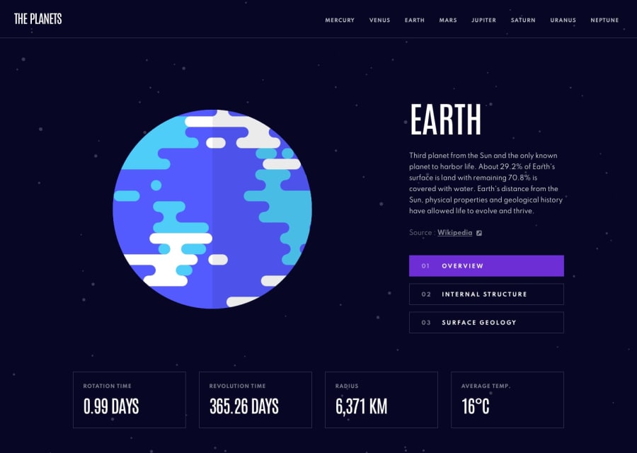
@tediko Thanks so much for the feedback. I wasn't happy with those anchor tag outlines, and as I had used the inbuilt numbering I could only fix it with a lot of JS. But on reflection it was an easy fix.. I just hard coded the numbers - there's only three in any case!

On the open nav menu, I'm still undecided whether it's a good idea to stop scrolling. My concern being that I somehow trap the user in the mobile menu. I agree though it does look at bit rubbish if someone scrolls!

Lastly on font-sizes, we have to disagree there. Maybe it's because I'm coding at night after a long day's work and my eyes are tired but I like the slightly bigger sizes!!

Thanks again for the feedback - checking out your solution now!!

1
P
Daveā€¢ 5,245

@dwhenson

Posted

@tediko Oh man just checked yours amazing work!! Love the home page really nice stuff!!

0
P
tedikoā€¢ 6,530

@tediko

Posted

@dwhenson I see you have dealt with the li and anchor problem. Small tip is that instead of giving li styles to anchor (nothing wrong with that I think) you could also make your anchor position: absolute and take full width/height of relative element which is li. You can also use :focus-within pseudo-class on your li element but the downside of that solution is that you can't use :focus-visible along with this.

When it comes to font-size. If you're happy with that I am too! :) Personal preference.

Thanks for checking my solution, I am glad you liked it! :)

0
P
Emmilie Estabilloā€¢ 5,540

@emestabillo

Posted

Hi Dave, well done on this project! I'm not familiar with 11ty, so I'll just share a few thoughts on UI/UX:

  • I would pick one of the planets and show it on the home page. For users who are not familiar with the design, it would be odd to find a blank page. They might think there is something wrong with the site. IRL, I imagine you'd be in talks with the client or designer.

  • The anchor tag IDs in the tabbed section can be a little hard to use on smaller devices. Maybe better to let the user decide when to scroll down instead of jumping right to the text upon button click.

  • Between 823-858px, the navbar items seems to be shifting into different layouts

  • One other minor thing is to add smoother transitions

Congrats on adding a stack to your skillset! And increasing font sizes as seen here are much better on the eyes IMO :-)

Marked as helpful

1

P
Daveā€¢ 5,245

@dwhenson

Posted

@emestabillo thanks so much for the feedback.

I think I've addressed most of the points you raised (I thought Earth seemed most appropriate for the Home page!)

I've struggled to make this work on mobile devices, as the links are up top but the text below the image. I've stopped the auto scroll, and will work on making the top row narrower later - I've got the issue there...

If you have a moment, could you just add a bit of advice regarding 'smoother transitions'? I had added a short one on hover - are you suggesting that should just be slower, or something bigger?

Thanks so much for the feedback - really appreciated!

1
P
Emmilie Estabilloā€¢ 5,540

@emestabillo

Posted

@dwhenson I took a closer look at the code and yes, you did use hover transitions on the project but it's the same code for all elements. Perhaps I was looking at the "Source" text, where background-color and border does not apply, therefore the global style transition: background-color 200ms linear,border 200ms linear; also does not work on it.

'Earth' is a great choice for the home page, but maybe instead of 'Home' as the heading, use the actual planet name :-)

One more thing, if you will, is to place a bit of padding between the statistics and the bottom gutter.

1
P
Daveā€¢ 5,245

@dwhenson

Posted

@emestabillo thanks for the clarifications. I really struggled with that bottom gutter spacing on mobile.

1

Please log in to post a comment

Log in with GitHub
Discord logo

Join our Discord community

Join thousands of Frontend Mentor community members taking the challenges, sharing resources, helping each other, and chatting about all things front-end!

Join our Discord