


Hi Chamu
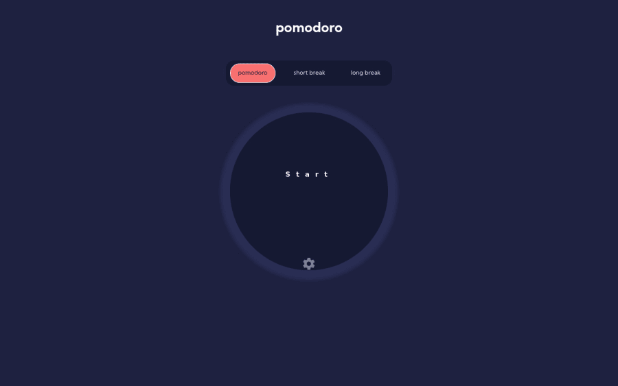
I recommend you rethink your styling (and some html) for the pomodoro buttons so they can be keyboard accessible. Here's what I managed to do in browser that would
- allow keyboard focus/interaction (you *need to remove the tabindex="0" from all inputs! Very important, that)
- let the labels control the size of the buttons, not the input which should be visually hidden but still accessible
@media screen and (min-width: 768px) {
  .break__mode__form {
    /* width: 450px; */
  }
  .break__mode--btn {
    /* width: 120px; */
    /* padding: 24px; */
  }
  input[type="radio"]:checked + label.break__mode__ctrls {
    /* line-height: 48px; */
  }
}

.break__mode__form {
  /* width: 87.2%; */
}

.break__mode--btn {
  /* width: 106px; */
  /* padding: 16px; */
  /* height: 40px; */
  /* -webkit-appearance: none; */
  /* -moz-appearance: none; */
  /* appearance: none; */
  /* border-radius: 30px; */
  border-radius: 5em;
  height: 0;
  width: 0;
  opacity: 0;
}

.break__mode__ctrls {
  /* position: absolute; */
  /* left: 10px; */
  /* top: 16px; */
}

label {
  height: 100%;
  padding: 1em 1.25em;
  border-radius: 30px;
}

.pomodoro__ctrls {
  display: flex;
  align-items: center;
  justify-content: center;
}

input[type="radio"]:checked + label.break__mode__ctrls {
  /* place-content: center; */
  /* top: 3px; */
  /* text-align: center; */
  /* line-height: 40px; */
}

// NOTE you may prefer to use the :focus-visible pseudo instead
input[type="radio"]:focus ~ label {
  outline: 3px solid paleturquoise;
}
I hope this makes sense as you go through and apply these in browser. Try to use your keyboard as you go and it should make sense
It would be nicer with the focus state to use a border rather than outline on the label tbh, then you could have the nice curved radius. Give the labels all a transparent border as their base style, then add a color to that border on focus. Make it obvious for keyboard / assistive tech users where they are on your page.
I can't help with the other radio question you raise as I'm not sure what the design is meant to look like. (And I need to go make my dinner :)
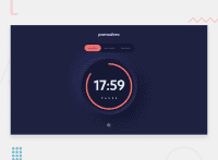
Best of luck with it, it's looking really nice!
@Gracesnow, thank you for the insights. Yes, making the labels control the size of the buttons is understandable. I got it mixed up when I positioned the labels with with absolute, didn't think of the trick you mentioned above of setting the width and height of .break__mode--btn to 0. Thank you

