


@SzymonRojek
Posted
Hi Liampc,
Well done :D
I have checked mainly your HTML, a few tips below:
- remove styles CSS (footer) and transfer them to the CSS file;
- instead of using div class="main" you can take the main tag;
- instead of div class="card-header" => the header and instead of div class="card-stats" => ul > li;
- in my opinion you don't have to use div class="avatar", just put img inline in the HTML structure;
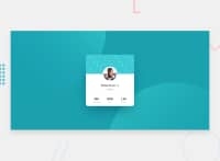
- this is a single page component so you can add the h1 tag => Victor;
- circles: also these two divs are unnecessary => the circles are a bit tricky in this challenge: I have used pseudo-elements, position absolute, vw and vh, background url, transform translate and @media;
- I'd recommend learning BEM naming convention;
- check a project in your browser on different devices (mobiles, tablets) by using the inspector => circles;
- a few days ago I have received information that giving an explicit height and width to the container / card it is not a good practice especially that we want to use the flexbox or grid. It is essential to understand well the height and width vs min-height/max-height & min-width/max-width. In this case, we don't have to give items height unless they have a background or absolutely-positioned or floated elements within them that would not normally be accounted for in the height of an element. Experienced developers use min-height and min/max-width more than anything else. It allows elements to grow and shrink.
Ps. Don't forget to upvote any comments on here that you find helpful.
Greetings :D

@docuong0912
Posted
@SzymonRojek Sir, can i have some quick question
-When should i use min/max-width/height?
-The circle part in my solution,I used position absolute and border-radius, is that ok sir?
-I'm getting used to make responsive web page but my result does not as i expected, any advice sir?
@SzymonRojek
Posted
@docuong0912
Mostly I am using max-width, min-height, I don't have to do explicit height and width because I am using flex-box so paddings, margin are useful and it works well - also, everything depends on the context, project. Circles => I have used position absolute and relative with pseudo-elements.
I think, one of the best solution is done by @ApplePieGiraffe check it out here
Have a nice coding time :D
@liampc
Posted
@SzymonRojek Thank you very much for giving very detailed feedback! Especially for pointing out the bad practices :)
@docuong0912
Posted
@SzymonRojek thank you,sir
