


Raymart Pamplona• 16,090
@pikapikamart
Posted
Hey, great work on this one. Layout in desktop is good, responds well I guess and the mobile layout is good as well.
Some suggestions would be:
- Avoid using
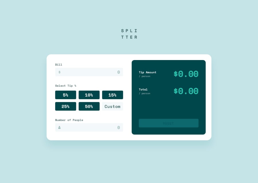
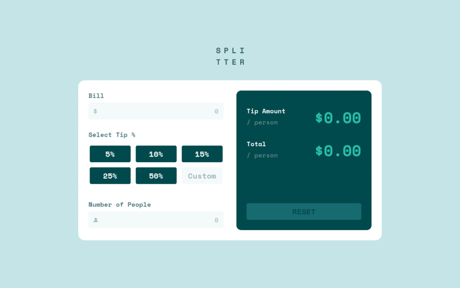
height: 100vhon a large container. If you inspect your layout in dev tools at the bottom, you will notice that the top part is cut off because of the.appselector only uses the remaining viewport, instead you can just remove it or replace it withmin-height: 100vh. - Always have a
mainelement that will wrap the whole main content of the webpage. On this one, the.appcould have usedmaininstead of justdiv. - The
altvalue for the website logo should bealt="splitter", since the image already have the text needed. Also, avoid adding words that relates to "graphic" like "logo, image, picture.." as aaltvalue,imgis already an image, no need to describe it. - Always have an
h1on a webpage. On this one, theh1would be a screen-reader only text. - When using heading tag, make sure you aren't skipping a lower level heading, if you use
h5make sureh1, h2, h3, h4are present before theh5. - Your error message of
can't be negativeis still visible for the screen-reader,opacityalone won't suffice, usevisibility: hidden, this way the error will only be visible both to sighted users and screen-readers users, if and only if theinputis wrong. Also, the error-message should have anidattribute, which will be reference by theinputas the value for thearia-describedByon it, if theinputis wrong. This way, users will know what is the error that they had made. - Using
divfor those tip selections is not really good. Always use interactive html element for interactive component, likebuttonorinput type="radio"on this one. - The custom
inputneeds to havelabelelement, or anaria-labelto defined what it does. Also make us ofminattribute on theinput. - The same goes for the number of people
input, make use ofaria-invalidandaria-describedByto which points to the error element'sid - The
tip amountplus the word below it could have only used 1 heading tag. - The resulting number is not suited to be a heading tag, especially NOT
h1element. Just useptag on it, making it heading tag does not add any meaning at all. - Reset button should be a
button, notdiv. Also, it would be great to have anaria-liveelement on this one, so that when the user reset the form, the live element will say that the form has been reset. This way, it will be clearer for users what happened.
Just those above, still great job on this one.
Marked as helpful
2
Fidel Lim• 2,775
@fidellim
Posted
@pikamart Wow, thank you so much Raymart for this detailed report! Will definitely learn more about accessibility. Have a great day!
0
Fidel Lim• 2,775
@fidellim
Posted
@pikamart due to your suggestions, there are no more accessibility issues. Thanks again!
0
Raymart Pamplona• 16,090
@pikapikamart
Posted
@fidellim awesome !!
0
