Not Found
Not Found
Not Found
Not Found
Not Found
Not Found
Not Found
Not Found
Not Found
Not Found
Not Found
Not Found
Not Found
Not Found
Not Found
Not Found
Not Found
Not Found
Not Found
Not Found

Submitted

React Countries REST API + Styled Components

Aaron Stroudโ€ข 435

@astroud

Desktop design screenshot for the REST Countries API with color theme switcher coding challenge

This is a solution for...

  • HTML
  • CSS
  • JS
  • API
4advanced
View challenge

Design comparison


SolutionDesign

Solution retrospective


In this initial release, I deviated from the design in a couple of ways:

  • I left out the DarkMode label. I think it looks better as a single icon.

I still need to fix the blinding darkmode flash. It's annoying on the initial load, but it becomes downright infuriating when you rapidly navigate between border countries (while in darkmode).

I'm planning to use this Josh Comeau post as a guide The Quest for the Perfect Dark Mode, but I'm going to need to overhaul my themes and darkmode to fix the flash. ๐Ÿ’ฅ

Addressed:

  • <del>I used flex box for the grid, so I couldn't get the cards to justify along the sides (justify-content: space-between) with a gap. Should I refactor using css grid?</del> (Safari now supports gap with flexbox as of last month)

Community feedback

Jenโ€ข 1,230

@En-Jen

Posted

Hey Aaron, really well done!!๐Ÿ˜Š I went ahead and bookmarked it so I can study it more and learn from it. I really like the country card loaders that are displayed during the initial API call and the sound effect on toggle between light and dark mode is a really nice touch ๐Ÿ‘

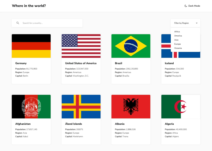
One suggestion I have is maybe have more of the country card loaders during the initial API call so that there aren't any big blank spaces on the screen without loaders if the user is viewing it on a wider desktop.

Also, it looks like you're doing quite a bit of prop drilling with the prop handleSearch (it's passed to FilterableCountryList, then FilterControls, then SearchBar before it's actually used) Could you declare that function in the SearchBar component so that it lives in the component that actually uses it? You could use Redux to manage the state and access countryFilter in App.jsx and then dispatch the action to change the state from SearchBar.jsx. I realize learning Redux may seem daunting but it's worth it!

Overall super awesome job and keep up the great work!! ๐Ÿ’ช

1

Aaron Stroudโ€ข 435

@astroud

Posted

@En-Jen Thanks for the feedback Jen and for the new term. I find myself "prop drilling" too often and it's annoying. I'm going to read up on the topic + Redux so I can avoid drilling when appropriate.

Thats a good point on adding more loaders. I suppose it'd be difficult to have too many.

What type of equipment are you sitting behind in your profile pic? I have a construction grade TLB Kubota myself (no where that big though) and I find "tractor therapy" quite useful after a long day of coding.

0
Jenโ€ข 1,230

@En-Jen

Posted

@astroud Yeah, it can be hard to avoid prop drilling as a project gets more complex if you're not using Context or a state management library. I was also running into that issue a lot too before my last project where I finally learned how to implement Redux.

Actually in my picture I'm sitting behind the wheel of an old, nonfunctional school bus that was in a beer garden as a seating area somewhere in Tasmania, Australia haha. Pretty random but I kind of liked the picture ๐Ÿ˜‚

1
P
tedikoโ€ข 6,560

@tediko

Posted

Hello, Aaron! ๐Ÿ‘‹

Congratulations on finishing another challenge! You did great on this challenge. I won't lie, this sound effect on toggle scared the hell out of me. I think it is unnecessary in such a project to add such effects, but as we're learning is good to play with the code. Atleast make it a little bit quieter. ๐Ÿ˜… Also, I added justify-content: space-between on .bhdLno container and it works good. It takes full width of container and place your flex items between like in design.

  • Add :focus pseudo class to interactive elements like anchors, buttons etc. Use outline property to make your website more accessible to keyboard users. Focusable elements like anchor, buttons or inputs they have applied default :focus pseudo class with outline property. These default styles are subtle and hardly visible tho. Furthermore every browser has a slightly different default style for the outline, so you probably want to change the default style. Read more about why we should change focus styles.

Good luck with that, have fun coding! ๐Ÿ’ช

1

Aaron Stroudโ€ข 435

@astroud

Posted

@tediko ๐Ÿคฃ I'm still laughing at your response to the toggle sound effects. You must keep your volume cranked up higher than me. I tend to run at 20% of my mac's max volume and compared the volume levels against Josh Comeau's volume levels (great developer, blogger, and the guy who wrote the useSound hook) on his personal site.

Thanks for the feedback. I'm going to add the a11y tweaks to my list.

0
Joanne Wangโ€ข 135

@joanneccwang

Posted

Try remove the margin of the cards and use gap property instead. gap will literally create gaps between flex items.

1

Aaron Stroudโ€ข 435

@astroud

Posted

@joanneccwang I held off doing that because only the Technology Preview release of Safari supported gap with Flexbox. But I just checked caniuse.com and Safari 14.1 finally supports it as of last month on April 25th, 2021.

For me, that might be the biggest reason to update to the latest version of Big Sur.

Thanks for the tip!

1

Please log in to post a comment

Log in with GitHub
Discord logo

Join our Discord community

Join thousands of Frontend Mentor community members taking the challenges, sharing resources, helping each other, and chatting about all things front-end!

Join our Discord