


@pikapikamart
Posted
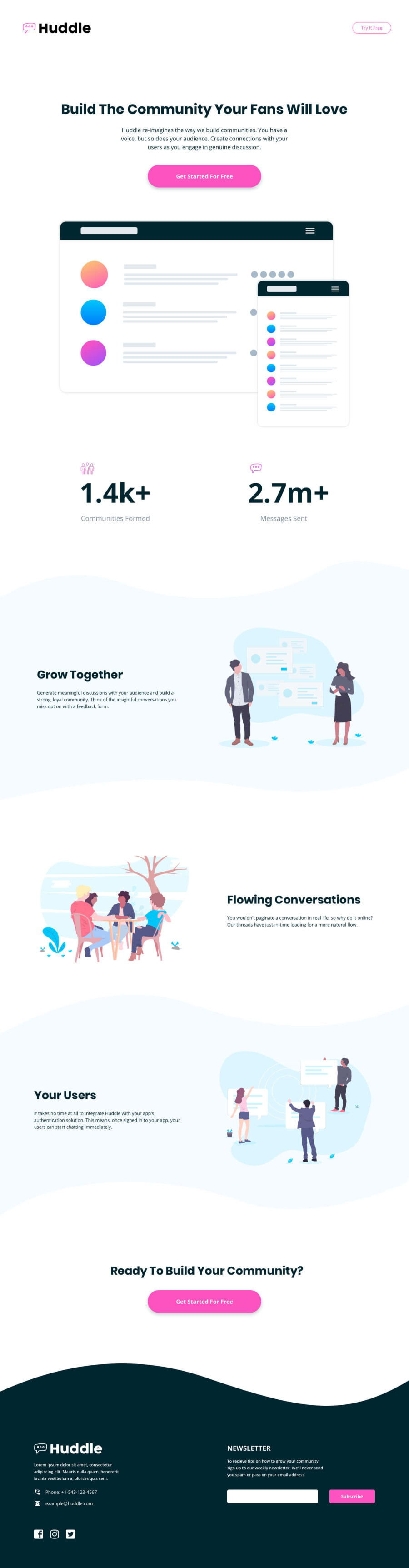
Hey, great work on this one. Layout is good both in desktop and mobile and it resizes well.
A couple of suggestions
-
Maybe you could adjust, lower the breakpoint for the newsletter section? Because many users won't be able to see the desktop layout for it since the width you specified in
min-widthis much higher than the resolution of the browser like mine. Lowering it down will be awesome -
Buttons. There are components which is supposed to be a link, but
buttontag was used instead ofatag which is appropriate in this one. Changing them toatag will make the markup more semantic.
Regarding you query. Well.
- I think making it as a background-image is the right way? Since they are just for decorations right so background-image is the best choice. But, as you said they will be cut out. Why? Because the container that will contain them don't have the needed height right. But still it is achievable with a little bit of tweaking using paddings or height. Like adding a padding-top to an article section and that allotted padding-top space is for the background-image of the curvy thing. That way, you can placed it fine and avoid usage of
imgtag. Because thepadding-topwill push the content towards bottom right, so there will be a space in the top. That is where you place the background-image. The position is justbackground-position: center topsomething like that.
I hope I gave some sense to what I have said. Overall, you did really good in here. While you're at it, it will be great to add some text if user enters wrong email. Well that is just a suggestion ^^
@jhunxein
Posted
Hello @pikamart, I'll definitely do what you said. Thank you for your words 😍
