Not Found
Not Found
Not Found
Not Found
Not Found
Not Found
Not Found
Not Found
Not Found
Not Found
Not Found
Not Found
Not Found
Not Found
Not Found
Not Found
Not Found
Not Found
Not Found
Not Found

Submitted

Responsive card, using grid

@Vidottizzz

Desktop design screenshot for the Four card feature section coding challenge

This is a solution for...

  • HTML
  • CSS
1newbie
View challenge

Design comparison


SolutionDesign

Solution retrospective


Can i do the desktop layout , without the position, relative/absolute? Just using grid?

Community feedback

P
Emmilie Estabilloā€¢ 5,540

@emestabillo

Posted

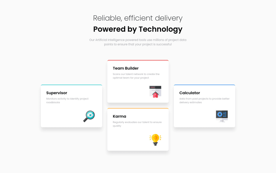
Hi @Vidottizzz, good job in completing the project! The trick is to make a grid with 3 columns and 4 rows. You can then position the left and right cards at grid-row: 2/3.

Other points:

  • Heading tags: h2 is missing between h1 and h3. It's not recommended to skip the order
  • At the 985px breakpoint, the cards are touching the side gutters and creating an overflow
  • Cleanup: As an example, margin: 0 auto 1rem auto can be simplified to margin-bottom: 1rem , and padding: 0 0 can be deleted (unless both are media query styles and are overriding previous declarations. But in this case, they are not)

Hope this helps!

Marked as helpful

0

Please log in to post a comment

Log in with GitHub
Discord logo

Join our Discord community

Join thousands of Frontend Mentor community members taking the challenges, sharing resources, helping each other, and chatting about all things front-end!

Join our Discord