


@pikapikamart
Posted
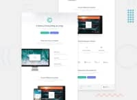
Hey, great job on this. The layout looks fine in desktop and in mobile it seems good as well, but there is this horizontal scroll which we want to avoid.
Some suggestions would be:
-
Making the font-text color more visible. Right now it is sort of gray-ish which is not really being contrasted well enough of the white background. Making it more darker will really help people to read it clearly.
-
I think your breakpoint is too far, you set the desktop only for
min-width: 1440px, this makes a bit lower of that, then they get the mobile version which is really too soon. You could either lower it down so that we will get desktop layout at those desktop points. -
Your footer logo gets overlapped by its sibling, it will be better if you removed the
margin-lefton thefooter-navsselector to prevent that. To achieve that spaced out layout on the footer, you could just add both thefooter-logoandfooter-navsinto one block, then make it flex. That way they will be side-by-side and more easy to handle. Also make themax-widthof thefooter-logoimage itself a fixed and not 100%, since it is a flex-container, width of element varies according to space left. -
Also, those footer links should be wrapped inside
atags, links and social media links. -
Mobile layout needs to be refactored. Right now that is causing the horizontal scroll, looking at it, I think you forgot to declare some on it.
-
Too many h1 elements, we want to avoid overusing h1 in a single page, you could just either use h2 on those. Making a habit of only using h1 per page will be really awesome.
But still, good work on this one^
@willinglywill
Posted
@pikamart Hey! thank you very much for such a detailed and helpful comment. I will actually start and fix those issues which you mentioned before I start a new project.
Some of the mistakes I even didn't realize and I say " oh boy! i really do that -_- " . It really helps me to develop, thank you again.
All the best!
