Not Found
Not Found
Not Found
Not Found
Not Found
Not Found
Not Found
Not Found
Not Found
Not Found
Not Found
Not Found
Not Found
Not Found
Not Found
Not Found
Not Found
Not Found
Not Found
Not Found

Submitted

Responsive, mobile-first, flex & grid

P
Katrien Sā€¢ 1,070

@graficdoctor

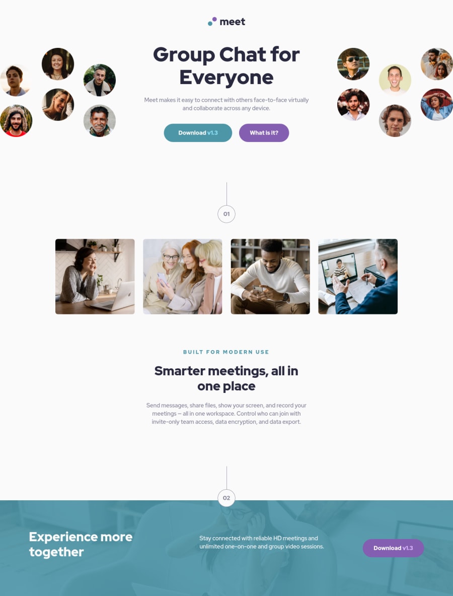
Desktop design screenshot for the Meet landing page coding challenge

This is a solution for...

  • HTML
  • CSS
1newbie
View challenge

Design comparison


SolutionDesign

Solution retrospective


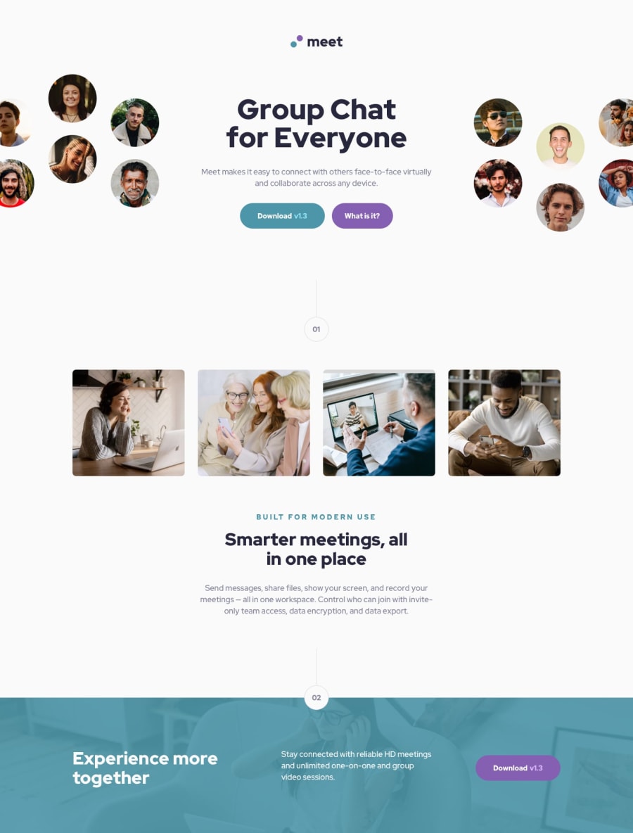
I was struggling adding the header- and footer-images in my css-file instead of overcrowding the html-file. I looked into @dmitrymitenkoff solution for a suitable approach. I somehow ended up locking in the width of my image-container. I probably need to refactor the code to find out why. That has to wait. Happy I finished this. Learning to code while working is not that obvious.

Community feedback

P
Emmilie Estabilloā€¢ 5,540

@emestabillo

Posted

Hi Katrien, great job! Those images are indeed very tricky. For the header images in smaller widths, I would try adding something like min-height: 15rem to .tablet-hero so that it doesn't cut out around 400px. Another approach is to increase the height and set the background size as contain. And other stuff - it'd be nice to have hover transitions on the buttons. Hope this helps!

Marked as helpful
0

P
Katrien Sā€¢ 1,070

@graficdoctor

Posted

@emestabillo I adjusted the min-height and went through some others widths and heights aswell to make it a bit more clean. Thank you for the advice.

1

Please log in to post a comment

Log in with GitHub
Discord logo

Join our Discord community

Join thousands of Frontend Mentor community members taking the challenges, sharing resources, helping each other, and chatting about all things front-end!

Join our Discord