


hi @clazikar - good work on your first major design. 🙌 I have to say you've picked a tricky one to start with! I've done a few easier ones and am working may way up to this one so I was interested to see you approached things. 👀
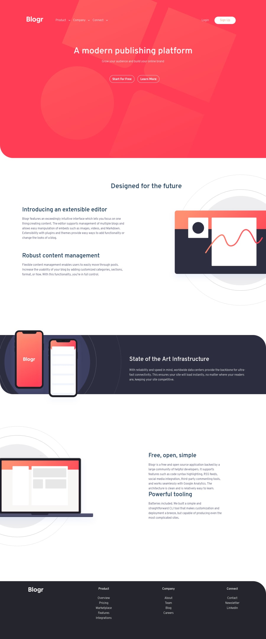
I can see a few areas you might like to have another look at, mostly in the top tricky section as it seems you've done really well on the site after that.
-
The header looks very large when I open things - I'm not sure you need the
max-height: 95vhsetting? Things look a bit better when I remove it. At least at the larger screen sizes - I tend to use some padding to increase the size on these types of headers. -
I would suggest that the hamburger menus be
buttonelements rather thandivs as they activate a change on the page. I also saw that the elements don't disappear at larger screen sizes, which they probably should as it's a bit confusing for users if they remain there with the entire menu showing as well. -
For the hover menus, I can't access the drop-downs as when I move my mouse out they disappear! I was wondering how I would approach this and I thought I might follow the approach in this article: https://css-tricks.com/in-praise-of-the-unambiguous-click-menu/
Personally I hate hover drop down menus! - Oh I just double checked and they seem to work nicely narrow viewports so it's just a desktop issue it seems.
- And lastly, a small one, but all those links at the bottom would probably be better off in a
navjust to let screen readers and other tech users know what the region contains and it's purpose.
Please don't let these small points demotivate you though! This is great work and good one for pushing yourself here! 👍 I'll be trying this one in a week or so probably so you can get your revenge on me then! 🙂
Cheers and keep up the good work!!! 👋

