


@jnnrdn
Posted
Hi Logan!
If I got it right and this is your first attempt ever at building something with HTML and CSS, you've done a great job! I'd never have guessed it from the looks of it.
Here's some feedback:
-
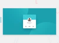
You have some validation issues. Firstly, you're using section elements without headings. Semantically, the person's name would be a good fit for an
h1in this case (yourbox__title-element). That way, you wouldn't need to enclose it with b-tags either, since headings are bold by default. Secondly, you also have a redundant p-tag that generates an error. (See the full list here: https://validator.w3.org/nu/?doc=https%3A%2F%2Fprofile-card-component-one-lemon.vercel.app%2F) -
On landscape mobile, there's no whitespace above and under the card, and the footer overlaps the bottom of it (I made the same mistake when I did this challenge).
-
The width of the card behaves a bit weird in breakpoints below 540px since it grows and gets wider than in larger screens. You might want to add a max-width here.
On a more general note, it's great that you dare trying out BEM and SCSS in your first attempt! But if you're new to HTML and CSS, my advice is to focus on getting comfortable with these basics first and foremost. Getting them right is so crucial for understanding both the "whys" and "hows" of more advanced concepts. Knowing when to not add on more complexity is a big part of this in my opinion. Technically, things like BEM and SCSS aren't needed for small projects like this one. You'd get by just fine (IMO even better) with the refreshing simplicity of pure HTML and CSS. I think the biggest reason why you're often seeing concepts like these being used in challenges like this here is that people who are ready to take them on see it as an opportunity to practice, not because they're needed.
All-in-all, I think you're doing great! If you keep at it and practice more basics you'll be able to call yourself a frontend developer in no time.
@LoganWillaumez
Posted
@jnnrdn Hi,
thank you a lot for your feedback, it realy helped me ! (It's always difficult to know the good way of doing things :) ) !
I have reworked my code as you said without SCSS and BEM (I fit with a more basic way, good to know it's not necessary or overkill for this kind of project) and change my media queries.
I have some of questions about this :
-
For media queries, what is the good way to use the orientation(landscape/portrait?) use different CSS stylesheet (ex. mobilelandscape.css/mobileportrait.css)? Or one mobile stylesheet with media queries into it?
-
How can I know all the goods media queries for all devices? Is there a good way for being able to fit on all devices around the world?
Again, thanks for your feedback and your motivation, I hope to understand the good way and concepts of this huge but exciting world!
@jnnrdn
Posted
@LWhills No problem, I'm glad it helped :)
You really only want to serve one single CSS file to the client (the user's computer), so stick with one stylesheet only. Once you start using Sass you can break it up to make it easier to work with, but even then all of the parts should be used as building-blocks to create the actual stylesheet at the end.
Just make sure to structure your CSS stylesheet well, so that it's easy to understand and find things. If it becomes large (which it soon often does), you can make a table of contents of sorts with comments at the top. Read more about creating well structured stylesheets here
To answer your second question, I think the best thing is to not get too hung up on device sizes. Use the responsive mode when checking mobile in the devtools and just see where different things starts to look or behave weird, then add a media query for that. There are so many different devices today and there won't be any less in the future.
Also, try to work as much with the browser as possible. It's fluid and mobile-friendly by default (disable the stylesheet for a website and see for yourself what happens when you resize the browser window). Many of the problems we have to fix with media queries we've caused ourselves to begin with by adding complex styles for larger screens first. By using the so called "mobile-first" approach (=style for the smallest screens first), we can avoid setting ourselves up like that. Here's good article about the mobile-first approach to writing stylesheets
Good luck! :)
