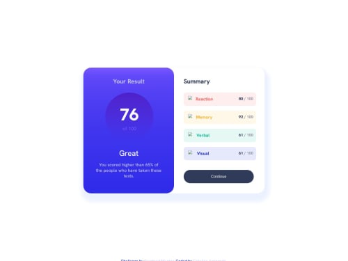
Responsive Results/Summary Component SASS

Solution retrospective
I found an error compilation with @content in @media queries (that's because the media queries are directly in the class .container). Style Rule said 1440px, so I made it, but in a simple notebook pc, it looks in the mobile version (and it's not in order).
Please log in to post a comment
Log in with GitHubCommunity feedback
- @barcaca
Great job on completing the challenge!
It seems that the desktop version is not displaying correctly because you set the
minimum width (min-width) to 1440pxHere are a few suggestions to enhance your code further:
- Your media query for the screen width seems to be set for larger screens. Consider adjusting it to
@media screen and (min-width: 796px)for better responsiveness.
.container {
    @media screen and (min-width: 796px) {
        /* Styles specific to larger screens */
    }
-Remove
margin-leftand addmargin-inline: auto:.container .summary { border-radius: 32px; /* Remove margin-left and add margin-inline:auto */ margin-inline: auto; /* Centering horizontally */ } .container .results .circle { width: 200px; height: 200px; border-radius: 50%; /* Remove margin-left and add margin-inline:auto */ margin-inline: auto; /* Centering horizontally */ background: linear-gradient(hsl(256, 72%, 46%), hsla(241, 72%, 46%, 0)); }This adjustment ensures that the elements are centered horizontally without using
margin-left. Themargin-inline: autoproperty is a shorthand for setting bothmargin-leftandmargin-rightto auto, which is commonly used for centering block-level elementsGood luck with your coding, and keep up the good work!
- Your media query for the screen width seems to be set for larger screens. Consider adjusting it to

Join our Discord community
Join thousands of Frontend Mentor community members taking the challenges, sharing resources, helping each other, and chatting about all things front-end!
Join our Discord