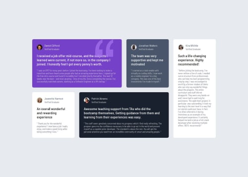
Submitted 3 months agoA solution to the Testimonials grid section challenge
Responsive Testimonials grid section challenge using Grid

@MgMyatHtayKhant
Solution retrospective
What are you most proud of, and what would you do differently next time?
I'm proud of using Grid. It's very handy.
Code
Please log in to post a comment
Log in with GitHubCommunity feedback
- @glrodriperez98
@MgMyatHtayKhant,
Great job! Great use of CSS custom properties and semantic HTML This makes your code clean, easy to update and accessible. I also thought your media queries and grid-template-areas approach were effective. The layout scales nicely across breakpoints and mirrors the original design closely.
Here's some feedback:
- Your box-shadow is a little heavy. Try
box-shadow: 0 1.5rem 2rem rgba(0, 0, 0, 0.1)or using a lighter customer property. - You’re repeating a lot of border-radius and flex styles like
.image-wrapperand.author. Consider grouping these into utility classes or using BEM-style naming for better reuse and scalability. - The quotation background image in
.testimonial-1::afterlooks great! But make sure it doesn’t overlap too much with text at smaller screen sizes. Maybe reduce its opacity or move it further to the right on medium screens
All in all amazing job! Good luck on your journey.
Kind regards, G
Marked as helpful - Your box-shadow is a little heavy. Try

Join our Discord community
Join thousands of Frontend Mentor community members taking the challenges, sharing resources, helping each other, and chatting about all things front-end!
Join our Discord