Results Summary Component Challenge Solution

Solution retrospective
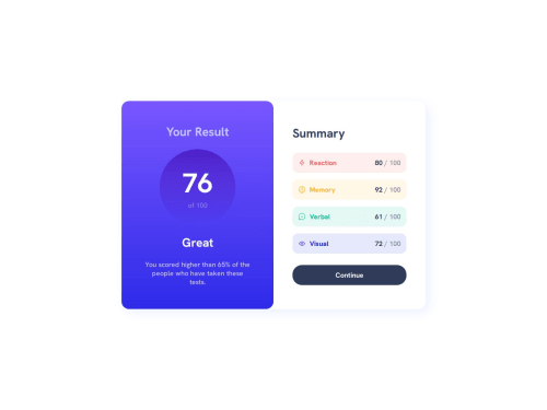
I'm proud that i was able to complete this challenge, and got a similar look to the original design!
What challenges did you encounter, and how did you overcome them?When i was doing the responsive, i realized that the header wasn't having the same height as the container, so i search for a solution and learned the "stretch" value of the align-self/align-items property. It helps me to achieve the result i was looking for. Also i tried to get the same look from the desktop version changing some sizes, and getting used to the em sizes.
What specific areas of your project would you like help with?I'd love any advices about the media queries i used for this challenge, but any kind of feedback is more than welcome! :)
Please log in to post a comment
Log in with GitHubCommunity feedback
No feedback yet. Be the first to give feedback on 6xg0d's solution.
Join our Discord community
Join thousands of Frontend Mentor community members taking the challenges, sharing resources, helping each other, and chatting about all things front-end!
Join our Discord