Not Found
Not Found
Not Found
Not Found
Not Found
Not Found
Not Found
Not Found
Not Found
Not Found
Not Found
Not Found
Not Found
Not Found
Not Found
Not Found
Not Found
Not Found
Not Found
Not Found

Submitted

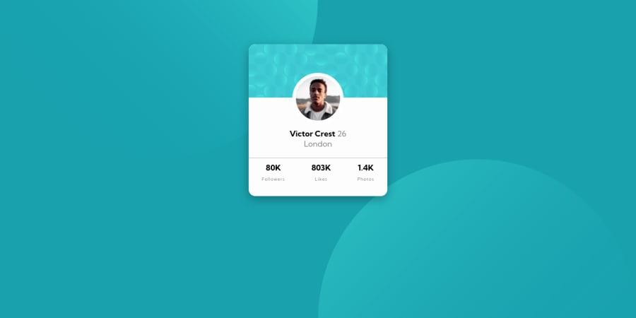
Simple card web page using HTML and CSS only

@IvanaCliffords

Desktop design screenshot for the Profile card component coding challenge

This is a solution for...

  • HTML
  • CSS
1newbie
View challenge

Design comparison


SolutionDesign

Solution retrospective


The background images didn't behave the way I wanted them to behave, so I had to limit their width in order to fit the screen. Any other ideas on how to make them look good in both, mobile and bigger screen? Thank you!

Community feedback

CyrusKabir 1,885

@CyrusKabir

Posted

hello my dear friend ♥ you can easily solve the svg background problem by simply just using background properties in right way

  • so you have two so you just separate them with "," in background property. then set the position of them from right and bottom ( i mean change default direction which is left and top) then using vh and vw (vh for y , vw for x).sorry if my English is bad also you can check others or mine solution for that background too.
  • other problem in your project is color. that name , numbers are not pure black if you see style guide you can find out.

Marked as helpful

1

@IvanaCliffords

Posted

@CyrusKabir Thank you so much, I truly appreciate it.

1
P
Ken 4,915

@kens-visuals

Posted

Hey @IvanaCliffords 👋🏻 it's me again 😅

I have some quick tips for the accessibility issues and some other things.

  • First, the background bubbles should have aria-hidden="true”, because they are for decoration. You can read more about aria-hidden here. Here's an example:
<img class="bg-pattern-top" src="images/bg-pattern-top.svg" alt="" aria-hidden="true”>
<img class="bg-pattern-bottom" src="images/bg-pattern-bottom.svg" alt="" aria-hidden="true”>
  • Next, let's center the card, so here's how to do it:
body {
    width: 100%;
    background-color: hsl(185, 75%, 39%);
    display: flex;
    min-height: 100vh;
    align-items: center;
    justify-content: center;
}

I hope this was helpful 👨🏻‍💻 If you want to see a different approach for the background images, you can check out my solution, if you have any question about my solution, feel free to drop them here. Cheers 👾

Marked as helpful

0

@IvanaCliffords

Posted

@kens-visuals Thank you so so much. I kind of postponed learning what each of 'justify' and 'align' (both, 'content' and 'items') properties do, but now I've got it. Thank you!

0
P
Ken 4,915

@kens-visuals

Posted

@IvanaCliffords you're very welcome 😇

0

Please log in to post a comment

Log in with GitHub
Discord logo

Join our Discord community

Join thousands of Frontend Mentor community members taking the challenges, sharing resources, helping each other, and chatting about all things front-end!

Join our Discord