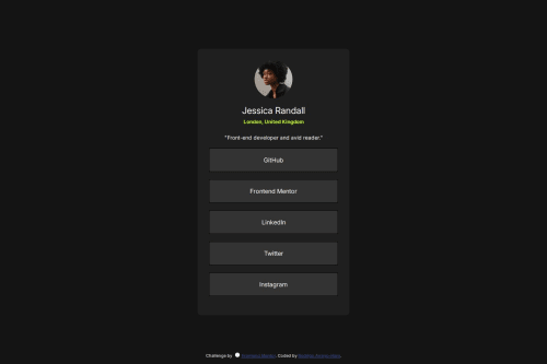
Solution retrospective
I'm proud of the progress I've been making so far. I finally understand the margin spacing, how the list item tag and the anchor tag work together (i.e., anchor having its inherent style; overriding the li), how important it is to adjust the anchor within the list item for a more user-friendly interaction, and how to use the 'transition' CSS rule.
What challenges did you encounter, and how did you overcome them?Encounters:
- The margin spacing was again a problem in this project, but fortunately, I was able to finally understand how to execute this CSS sizing rule.
At first I had this setup:
body {
background-color: hsl(0, 0%, 8%);
color: hsl(0, 0%, 100%);
font-family: 'Inter', sans-serif;
overflow: hidden;
height: 100vh;
display: flex;
justify-content: center;
align-items: center;
}
/Missing a container for .profile-card. This made the design not correctly read the margin: 0 1em within my .profile-card./
.profile-card {
background-color: hsl(0, 0%, 12%);
width: 400px;
display: flex;
flex-direction: column;
text-align: center;
padding: 30px 30px;
border-radius: 8px;
margin: 0 1em;
}
I then updated it by adding a .profile-container around the .profile-card and moving the height, display: flex, and putting the margin: 0 1em within the .profile-container:
body {
background-color: hsl(0, 0%, 8%);
color: hsl(0, 0%, 100%);
font-family: 'Inter', sans-serif;
overflow: hidden;
}
.profile-container {
height: 100vh;
display: flex;
justify-content: center;
align-items: center;
margin: 0 1em;
}
.profile-card {
background-color: hsl(0, 0%, 12%);
width: 400px;
display: flex;
flex-direction: column;
text-align: center;
padding: 30px 30px;
border-radius: 8px;
} This correction helped me achieve the margin spacing I was looking for, and also, when sizing the window down to a width of 375px, it was showing better responsive fluidity.
- Another problem was combining the anchor with the list items. So without the anchor tag, the list items were easy to code, and a hover rule was quickly executed, however, the challenge started when I inputted the anchor tags within the list items.This led to a problem, every time I hovered over the li tag, the words weren't changing to the color black because it wasn't within the content of the anchor, nor did it show the click finger icon due to the same reason:
li {
list-style-type: none;
background-color: hsl(0, 0%, 20%);
color: hsl(0, 0%, 100%);
margin: 20px 0;
padding: 20px;
border-radius: 8px;
}
li a {
text-decoration: none;
color: hsl(0, 0%, 100%);
display: block;
}
li:hover {
background-color: hsl(64, 96%, 57%);
color:hsl(0, 0%, 0%);
}
li a: hover {
color: hsl(0, 0%, 0%);
}
So I need to somehow expand the anchor tags within the list items, which I then ended up with this:
li {
list-style-type: none;
background-color: hsl(0, 0%, 20%);
color: hsl(0, 0%, 100%);
margin: 20px 0;
border-radius: 8px;
display: flex;
justify-content: center;
align-items: center;
transition: background-color 0.3s;
}
li a {
border: 1px solid black;
text-decoration: none;
color: hsl(0, 0%, 100%);
width: 100%;
height: 100%;
padding: 20px;
}
li: hover {
background-color: hsl(64, 96%, 57%);
}
li:hover a {
color: hsl(0, 0%, 0%);
I first had to add a flex-box within the 'li' selector to make sure the items were centered, since I was going to expand them, so that I had responsiveness when sizing. Also, I removed the padding of 20px on the 'li selector' since I needed to expand the 'li a selector to the same size for it to cover the whole space (keeping both would give me a padding of 40px, increasing the size even more).
What specific areas of your project would you like help with?What would be the best way to utilize the hover CSS rule? I used list items and anchors. Should I try to combine the anchors with another set of tags to get better interactions, or would it be the same outcome?
How often should I be using Flexbox? Can I use it for anything that needs centering, or is it better to just use text-align: center to keep it simple?
Please log in to post a comment
Log in with GitHubCommunity feedback
No feedback yet. Be the first to give feedback on Rodrigo's solution.
Join our Discord community
Join thousands of Frontend Mentor community members taking the challenges, sharing resources, helping each other, and chatting about all things front-end!
Join our Discord