


@folathecoder
Posted
Hi Drallas!
Your implementation is clean and looks great. Congrats on your journey and keep it up!
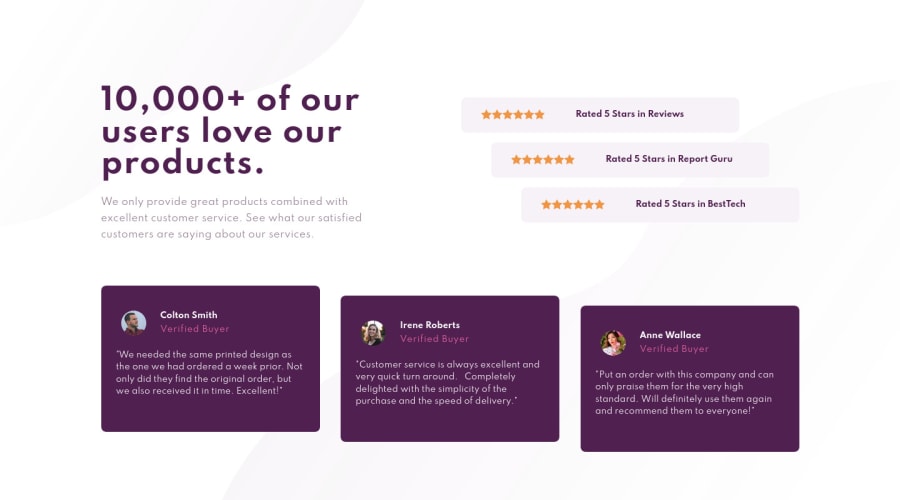
The responsiveness of the page is great on only desktop and mobile. The tablet view should not take the form of a mobile screen. Try to make that tablet more responsive or look more like a tablet by making great use of the available space. You can make the tablet layout look like the desktop, with minor tweaks!
Also, your testimonial cards should have a min-height and not a fixed height. Declaring a fixed height will make the content inside the cards to pop out when the screen is smaller. You can test this by displaying the page on a 240px-width screen.
A min-height will allow the content inside the card to determine the height of the card.
.cards__item { text-align: left; height: 248px; (min-height: 248px) color:hsl(0, 0%, 100%); border-radius: 8px; background-color: var(--very-dark-magenta); margin-bottom: 1rem; }
Just a few suggestions, I hope it helps...... Feel free to correct me if I am wrong!
Happy Coding!
@Drallas
Posted
@folathecoder
Thank you for your feedback, i will definitely refactor later today taking your feedback into account!
Greetings..

