


Abhik• 4,840
@abhik-b
Posted
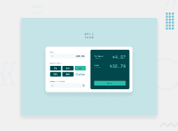
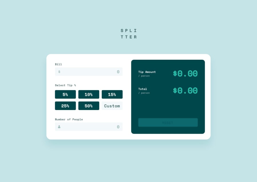
👋 Hi Massoud , Your solution is Awesome , it works perfectly & looks nice as well. Well Don 🥳🥳🥳
However I think if you use
max-width:860px(you can give any suitable fixed value ) instead ofwidth:60%then your responsiveness will be better & you can have the media query at768pxbecause at1024pxmobile view is not looking good !- in
right-columnsection , you have some p tags with classp1,p2, there instead of usingposition : relativeto position elements , you can have a parent div withdisplay:flex;justify-content:space-betweenlike shown below: (this is a better way than usingposition)
<div class="flex justify-between">
            <p class="">
              Tip Amount
              <span class="">/ person</span>
            </p>
            <p
              id="tip-amount"
              class=""
            >
              ₹4.27
            </p>
          </div>
Other than that your solution is amazing & Please keep contributing fantastic solutions like this 👍
Marked as helpful
0
