Not Found
Not Found
Not Found
Not Found
Not Found
Not Found
Not Found
Not Found
Not Found
Not Found
Not Found
Not Found
Not Found
Not Found
Not Found
Not Found
Not Found
Not Found
Not Found
Not Found

Submitted

Todo app | React | styled-components | Drag and Drop

Jen 1,230

@En-Jen

Desktop design screenshot for the Todo app coding challenge

This is a solution for...

  • HTML
  • CSS
  • JS
3intermediate
View challenge

Design comparison


SolutionDesign

Solution retrospective


Hey everyone, I'd really appreciate some feedback on this one. This was a really big project for me since I'm still pretty new to React and it's my biggest React project I've developed. It was also my first time styling a React project with styled-components. I really enjoyed the sass-like experience of using styled-components and being able to conditionally style elements with JS (very useful for the different colors with the two themes).

The main thing that still needs fixing is that when the user drops a todo item after dragging it (which is implemented with the react-beautiful-dnd library), sometimes there is a brief flicker on the items. Has anyone encountered this before in your projects and have you been able to fix it?

Another thing I'd love feedback on is the structure of my project. Should I be splitting my elements up into even more components? Some of the components I created are strictly css (with styled-components) and don't involve any React. I did this for things that are repeated a few times throughout the project, like for buttons with images in them and for elements wrapped in a box with the same border-radius, box-shadow, width, padding, etc. Is that an appropriate use of a component?

Any other feedback you have is totally welcome!

Community feedback

P
ApplePieGiraffe 30,545

@ApplePieGiraffe

Posted

Hey there, Jen! 👋

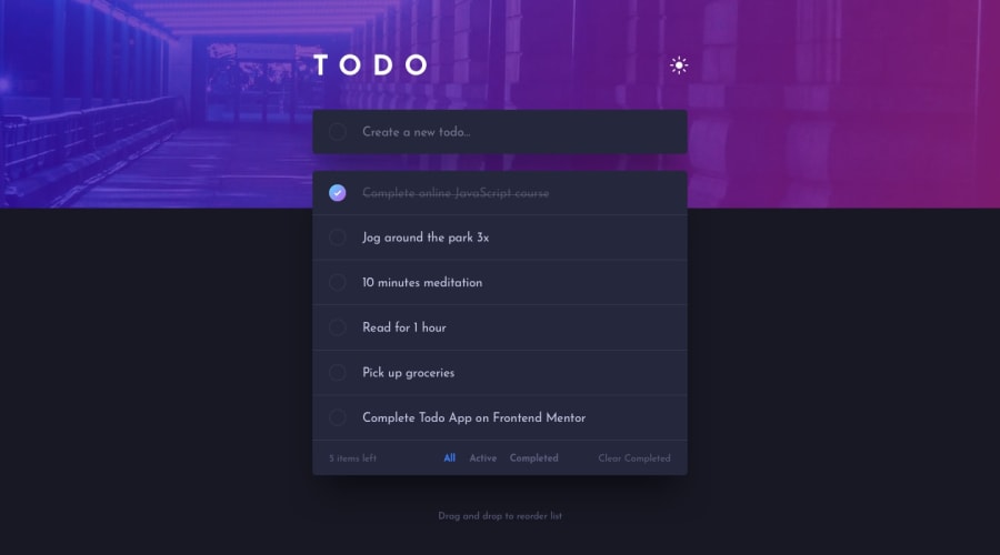
Nice to see you complete another challenge! 😀 Great job on this one! 👏 Your solution looks good and the to-do list functions well! 👍

I'm afraid I can't offer much advice about React (since I'm rather new to it myself), so I just suggest adding some labels to the interactive elements of the page to get rid of a few errors on your solution report and make your solution more accessible. Adding some outlines to things for when items are focused, too, would be a nice addition for keyboard users! 😉

Also, on my screen, there's a horizontal scroll bar that appears along the bottom of the page when the height of the to-do list becomes higher than what can fit in my viewport. IDK why that is but adding something like overflow-x: hidden to the body should get rid of it! 🙂

Keep coding (and happy coding, too)! 😁

2

Jen 1,230

@En-Jen

Posted

@ApplePieGiraffe Thanks for consistently checking out my solutions and for the feedback!! You're totally right about needing to make changes for improved accessibility. Adding labels and outlines for keyboard users is a great suggestion 👍 Also good catch with the horizontal scroll bar. I hadn't noticed that.

1
P
Matt Studdert 13,611

@mattstuddert

Posted

Great to see you post another project, Jen! How have you been getting on with React so far? It definitely takes on a new level of complexity as you build larger projects!

You've done an excellent job on this challenge. Your app looks great and functions as expected based on the project brief. Here are some thoughts after taking a look at your code:

  • I'm not a fan of the useViewport() hook. Having a resize listener constantly running on the window isn't something you want to do if it can be avoided. Is there a reason you opted for this approach as opposed to using a media query?
  • In the App.js file, you're defining a saveLocalTodos function and then calling it immediately. As you're calling it straight away, you don't need the definition at all. So you can remove the function and just set the items in the useEffect hook without it being wrapped in anything.
  • Don't only show the delete todo button on hover. As it is, people navigating using a keyboard can't delete todos. I'd recommend trying to navigate and complete tasks using only your keyboard on any projects you build. This will give you a good insight into whether or not your project is navigable by keyboard users.
  • As Steven mentioned, avoid setting height and width properties, except for particular circumstances where you have an obvious reason. Typically, you want the inner content of an element to dictate the dimensions of an element. For example, you've set a height on the todos. Try typing out a really long todo and see what happens. Ideally, you'd want the todo to grow with the content.
  • You've got Main.js and ItemBox.js in their own file, but they're not actually doing anything other than being exported. If you're creating a component, I would recommend trying to keep all concerns for that component locally in the file. I'd recommend reading this "styled-components happy path article by Josh Comeau". It will hopefully give you some more ideas on this. As with anything, keep practising, and you'll develop better habits as you become more experienced with the tool.
  • As Steven mentioned, the idea of React is to componentize code as much as possible to maximise reusability. An example of where you can break down a component further is the Todo.js. This could be broken up into smaller chunks, like the checkbox, text, and delete button.

I hope this helps. Keep at it and let me know if you have any questions! 🙂

1

Jen 1,230

@En-Jen

Posted

@mattstuddert Thanks so much for taking the time to have a good look at my code and give me such thoughtful feedback. 😊 I've just started learning React and I like the general idea of it, but I definitely still have a lot to learn so I really appreciate getting your feedback at this early stage in my learning!! This project has been a big learning experience for me.

  • Honestly the reason I opted for using the useViewport() hook was just because I wasn't sure how to conditionally change where the filter buttons are shown with just media queries but I'm sure I could figure it out with media queries if I really try. I hadn't thought about how there would be a resize listener always running in the window.

  • Good catch in the useEffect hook. I admit that my understanding of hooks still isn't great so that's definitely something I need to study more!

  • I've realized in building this project that accessibility is another thing I really need to take the time to learn more about and apply best practices with it in my projects! The delete button on hover is a great example of a place I could improve the accessibility.

  • I had never heard that you want to avoid setting height and width where possible, so that's something that's definitely good to keep in mind for future!

  • Thanks so much for sending that resource on styled-components!! I really like styling with styled-components and want to keep using that library but also want to use best practices with it 💅

  • I really appreciate the specific examples for where I could break down my components further. Time for a big refactor!

I'll get to work on improving the app and let you know if I have questions along the way! Thanks again so much!!

0
P
Matt Studdert 13,611

@mattstuddert

Posted

@En-Jen no problem at all! Please do let me know if you have any questions. The more projects you build, the more it will all start coming together. Keep up the great work!

1

@steventoben

Posted

This honestly barely looks like a React app to me. The styled components is completely unnecessary and makes the code almost unreadable. Some of your components aren't even React components, it's literally CSS applied to an HTML element in a JS file. That's a massive anti-pattern. You want to separate every part of an app as much as possible. Your React components don't really make sense to me, the point of React is atomic design, allowing for reusable components. You could have made a button component that would be used for all other instances of a button you had throughout the code. You should separate components by domain, down to the most basic level and build up. Regarding styling, I already say this to every single person on here so I'll keep it short; don't set your font-size in the html tag unless you set it to 100%(which is the same as doing nothing). And then of course I have to ask, where did your numbers come from? You heights, widths (which usually shouldn't be set at all), padding, margin, etc. The numbers look completely random, CSS requires logic to properly layout a design and make it maintainable. If you change a couple numbers the entire design is ruined. Also a lot of those effect hooks look like they aren't really cleaning up properly. Last thing is don't use flexbox for everything. There's a lot of hacky html with incorrect semantics, as well as hacky css, I'd try to make sure everything is properly setup you're not relying on unstable solutions

0

WictorNisa 150

@WictorNisa

Posted

@steventoben Damn

2
P
Matt Studdert 13,611

@mattstuddert

Posted

@steventoben it's great that you're giving feedback to others, but please check your tone. This is a community of learners, and we're here to support each other, not bash each other.

As to your comments, here are some of my thoughts:

  • You may not personally like Styled Components, but that does not mean it's not a valid approach. Personally, I absolutely love it and think it's a brilliant solution for styling React projects. I use it on Frontend Mentor!
  • Applying styles to elements that don't actually have any state, behaviour, etc. is fine and is in fact the way projects using Styled Components are built. You can even take it a step further and compose components to have a precise role, even if this is just to apply styles. In the Frontend Mentor codebase, we have components whose sole responsibility is to render some children and apply styles to them. This is perfect for making reusable flex and grid containers as an example. So it's not an anti-pattern. It's a different way of building a project.
  • I agree that it's best not to set height and width properties wherever possible. These should only ever be set for precise reasons, so this is a good catch.
  • You're saying there's incorrect semantics and hacky CSS, but it would be more constructive if you could provide some examples. If you could add some code snippets with suggestions for improvements that would be a great help to Jen.

Again, it's awesome you're taking the time to give feedback to others, but please do consider how others might interpret your comments 🙂

Edit: I noticed the files you mentioned for my second point (Main.js and ItemBox.js) after posting this, so I was actually talking about something slightly different. While these files aren't necessary for the context of this app, it's still not necessarily an anti-pattern in general. It's fine to create components to handle styling and layout exclusively.

4
Jen 1,230

@En-Jen

Posted

@steventoben thanks for taking a look at my code. I'll work on a big refactor to break down my components more. Could you give me an example of a place I'm using flexbox where you think I should be positioning in a different way? Also examples of where I have incorrect semantics and hacky CSS?

0

Please log in to post a comment

Log in with GitHub
Discord logo

Join our Discord community

Join thousands of Frontend Mentor community members taking the challenges, sharing resources, helping each other, and chatting about all things front-end!

Join our Discord