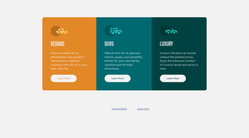
Responsive 3 Column Layout - Flexbox

Solution retrospective
This was my first responsive page design task and I feel like it went pretty well, for the majority of tutorials and reading I've done they said that using fixed widths for containers was a bad idea so I feel like I may have committed a cardinal sin at some point?
My main focus was to get flexbox working as intended, however I feel like an additional media query at a tablet-sized screen may have been useful as the design looks poor between 700-900px
As I said this is my first project so feedback is most certainly welcome and I appreciate any time you take looking through my solution.
Cheers, Dan
Please log in to post a comment
Log in with GitHubCommunity feedback
No feedback yet. Be the first to give feedback on Daniel Thane’s solution.
Join our Discord community
Join thousands of Frontend Mentor community members taking the challenges, sharing resources, helping each other, and chatting about all things front-end!
Join our Discord