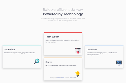
CSS Grid, Flexbox and Mobile-First Four Card Layout

Solution retrospective
I have more questions than anything.
What is best practice for overall layout? I've seen some solutions to this where they used flexbox on the header then used grid for the middle cards. I used margin auto on the header. Is it best to use flexbox?
Should you always use relative units for responsive design in every aspect (e.g., margins, padding, font size, etc.)? Someone cleverly used margin-block to center the outer cards in the grid area, I had to calculate the middle height then span across those rows to get the same effect. I didn't realize you could vertically center with margin-block. Is this common practice?
I'm confused when one should set definite sizes on height and width for a container. For example for the cards, I guess this is just determined by the rows/cols of the grid rather than explicitly setting the height/width. Is it best to just use max-width? What about height? Should one use something like min-height ever?
Please log in to post a comment
Log in with GitHubCommunity feedback
No feedback yet. Be the first to give feedback on a13g24’s solution.
Join our Discord community
Join thousands of Frontend Mentor community members taking the challenges, sharing resources, helping each other, and chatting about all things front-end!
Join our Discord