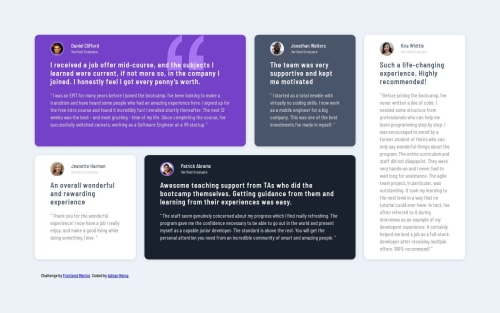
CSS GRID, media querys

Solution retrospective
First it looked excellent in the mobile view but in the PC view the design was broken so I had to start from scratch as I couldn't find the problem, I just did the right thing by not giving up
What challenges did you encounter, and how did you overcome them?I did not understand why or how to ensure that in the PC view, the cards take up all the space that I assign to them in the grid, so I had to start with the PC view to do everything until I finished in the cell phone view.
What specific areas of your project would you like help with?I would like to understand what needs to be done so that an element always occupies the entire area of its corresponding grid
Please log in to post a comment
Log in with GitHubCommunity feedback
No feedback yet. Be the first to give feedback on Adrian Reina Lobaina’s solution.
Join our Discord community
Join thousands of Frontend Mentor community members taking the challenges, sharing resources, helping each other, and chatting about all things front-end!
Join our Discord