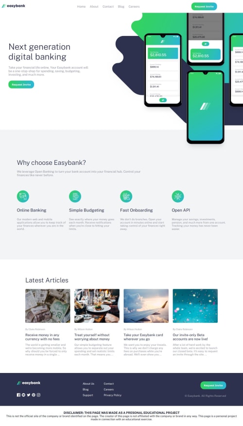
Digital Banking Landing Page

Solution retrospective
I'm particularly proud of how I handled the responsive navigation menu. Using vanilla JavaScript and a simple utility function (displayElement()), I was able to implement a mobile-first hamburger menu that toggles visibility cleanly without relying on any frameworks. The dynamic behavior during window resizing and click events shows a clear understanding of DOM manipulation and event-driven interaction.
I'm also happy with the use of CSS variables and embedded fonts to create a consistent and modern UI theme. The folder structure is clean and intuitive, which supports maintainability and scalability.
Next time, I would consider using aria attributes and better focus handling for accessibility improvements in the navigation menu. For example, ensuring the menu is keyboard-navigable and screen-reader-friendly.
I'd also refactor the JavaScript to separate concerns more cleanly, perhaps using a small component-based structure or ES6 classes/modules to make the logic more scalable for larger applications.
Additionally, I'd optimize the hamburger animation with transform and opacity transitions instead of toggling display, to create smoother effects and avoid layout reflow.
-
Responsive Navigation Logic Managing the toggle behavior of the navigation menu on different screen sizes was initially tricky. I had to account for screen resizes while ensuring the hamburger and close icons didn't clash or remain visible when they shouldn't.
-
Menu Display Flickering There was an issue where the menu would flicker or overlap with other elements during fast resizes or multiple clicks, especially on mobile devices.
-
For the menu logic, I used
window.innerWidthinside aresizeevent listener to dynamically check the screen width and hide or show elements accordingly. -
I introduced a simple
doAnimationflag to prevent multiple animations from running at once. This helped eliminate flickering and stabilized menu transitions.
These steps helped me achieve a smoother and more reliable user experience across devices.
What specific areas of your project would you like help with?I'm looking for feedback and suggestions on the following areas:
-
Navigation Toggle Logic (JavaScript)
- Is there a more efficient or cleaner way to handle the toggling of the hamburger and close icons alongside the menu visibility?
- Could the
doAnimationflag logic be simplified or replaced with a better pattern to prevent rapid clicks from breaking the UI?
-
CSS Responsiveness
- Do the media queries cover enough use cases for a fully responsive experience?
- Are there layout improvements or best practices I missed for better cross-browser compatibility?
-
Folder Structure & Optimization
- Is the current folder structure optimal for scalability?
- Should assets like fonts and images be better organized or served differently?
-
Accessibility Enhancements
- Are there specific ARIA roles, landmarks, or screen reader enhancements I should consider for the navigation menu?
Any constructive feedback on code readability, performance, or best practices would be greatly appreciated.
Please log in to post a comment
Log in with GitHubCommunity feedback
No feedback yet. Be the first to give feedback on Maxessien’s solution.
Join our Discord community
Join thousands of Frontend Mentor community members taking the challenges, sharing resources, helping each other, and chatting about all things front-end!
Join our Discord