

Easybank landing page using HTML, CSS, and JavaScript.

Solution retrospective
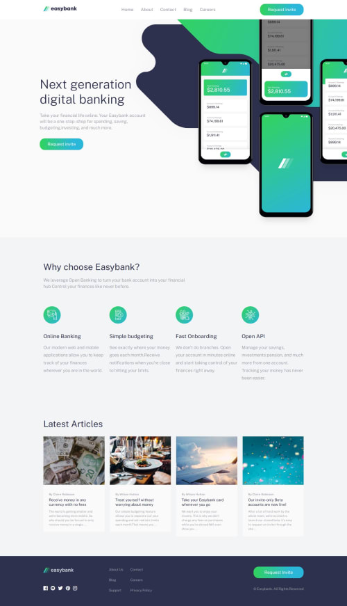
I feel proud of the way I managed to create a responsive user-friendly burger menu that can be activated by pressing an Enter key and accessed by using tab. I think I could have done a better job in creating a menu burger cross-like animation. The lines are not aligned evenly to create a perfect cross ❌.
What challenges did you encounter, and how did you overcome them?I've had some layering issues when adding a decorative element at the '.hero' section to the image with phones. The element would overlap the image. I set a z-index value of 2 for the <img> tag itself, and no z-index for the element. That way, the element would not overlap the image.
What specific areas of your project would you like help with?How to create that gradient background at the first section, when clicking at the burger menu?
Please log in to post a comment
Log in with GitHubCommunity feedback
No feedback yet. Be the first to give feedback on Yevhen’s solution.

Join our Discord community
Join thousands of Frontend Mentor community members taking the challenges, sharing resources, helping each other, and chatting about all things front-end!
Join our Discord