Expenses Chart Component -- Charts.css Framework and JavaScript

Solution retrospective
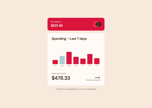
Really enjoyed learning Charts.css and reviewing the docs to create the bar chart. There are slight differences to the design, bar height white space, but I think it comes very close to the design.
One issue with this charts component design is the poor color contrast ratios. I changed the colors and added a pattern to the current day's color so it would stand out in the chart.
What challenges did you encounter, and how did you overcome them?Customizing the colors/design in CSS that differed from the default framework was a challenge. Used the browser dev tools to help solve my issues with the default tooltip design.
What specific areas of your project would you like help with?Any tips on improving accessibility are always appreciated.
Please log in to post a comment
Log in with GitHubCommunity feedback
No feedback yet. Be the first to give feedback on a-woodworth’s solution.
Join our Discord community
Join thousands of Frontend Mentor community members taking the challenges, sharing resources, helping each other, and chatting about all things front-end!
Join our Discord